cairo.BI
- What is cairo.BI?
- How to use charts and tables in cairo.BI?
- Home tab
- Warehouse - Warehouse value summary
- Warehouse - Warehouse values by product groups
- Warehouse - Warehouse values by producers
- Settlements - Summary
- Settlements - Payment terms
- Settlements - Contractors
- Settlements - Warehouses
- Settlements - Payment schedule
- Settlements - Settlement groups
- Sales - Annual summary
- Sales - Monthly analysis
- Sales - Sales by warehouses
- Sales - Sales by countries
- Sales - Sales by contractors
- Sales - Sales by routes
- Sales - Sales by commercial documents groups
- Purchases - Annual summary
- Purchases - Monthly analysis
- Purchases - Purchases by warehouses
- Purchases - Purchases by countries
- Purchases - Purchases by contractors
- Operators
- Operators-old
What is cairo.BI?
cairo.BI is a comprehensive Business Intelligence (BI) tool that integrates sales, financial, and warehouse data into a single environment, providing a complete picture of a company’s performance. It enables the creation of advanced reports, interactive dashboards, and forecasts, allowing real-time analysis of key indicators and trends. Thanks to intuitive visualizations and flexible analytical functions, it supports strategic and operational decision-making, increasing management efficiency at every organizational level.
What data can be analyzed?
-
Warehouse – warehouse values, stock structure (available, logistic reservations, customer reservations), analyses by product groups and producers.
-
Settlements – receivables, liabilities, balances, overdue items, payment schedules, contractors, currencies, settlement groups, and cash flow forecasts.
-
Sales – annual and monthly analyses, sales by warehouses, countries, contractors, routes, and sales document groups (GDH).
-
Purchases – similar analyses as in sales, broken down by warehouses, countries, and contractors.
Benefits of implementing cairo.BI
-
Faster decision-making: Access to up-to-date data allows immediate reactions.
-
Greater transparency: Easy comparison of sales results, costs, and warehouse stock levels.
-
Automated analysis: cairo.BI automates many reporting processes.
-
Error reduction: Data is retrieved directly from the ERP system, minimizing the risk of mistakes.
-
Better control: Managers gain a powerful tool for detailed business analysis.
How does cairo.BI integrate with cairo.ERP?
cairo.BI works in close integration with cairo.ERP. Data entered in the ERP system (such as sales, invoices, or warehouse stock) is automatically retrieved by the analytical module of cairo.BI and presented in the form of interactive charts and tables.
How to use charts and tables in cairo.BI?
Charts and tables in cairo.BI are fully interactive, allowing users to easily adjust the displayed data to their needs. This makes the analysis more transparent and flexible.
Available features in charts:
-
Interactive legend – clicking on an item in the legend hides or reveals the selected data series, making it easier to focus only on chosen indicators.
-
Tooltips – hovering the cursor over a point or bar displays detailed information about the value.
-
Scaling and filtering – in selected charts, users can narrow the view to specific ranges, enabling more detailed comparisons.
Available features in tables:
-
Column sorting – clicking on a column header sorts the data in ascending or descending order.
-
Search field – quickly filter data by typing any keyword.
-
Dynamic summaries – after applying a search filter, summaries automatically adjust to the displayed data, showing results only for the filtered records.
-
Data export – clicking the XLS button (located above the table on the right) allows downloading the content in Excel format, ready for further analysis.
Additionally, each tab contains filters, the set of which varies depending on the analysis area.
- Filters allow narrowing down the presented data only to selected categories, ensuring that the user focuses exclusively on the relevant dataset.
- Once the filter settings are changed, all charts and tables on the dashboard automatically update, displaying data consistent with the selected criteria.
Home tab
The Home tab in the cairo.BI system provides a summary of key financial and operational information, enabling a quick overview of the company’s situation. It is a kind of start dashboard that combines the most important indicators from sales, settlements, and warehouse management.
The screen includes the following elements:
-
Net sales in the month – presents the current sales result along with the change compared to the previous month.
-
Sales profit in the month – shows how much the company actually earned in the given month.
-
Profit percentage in the month – a profitability indicator calculated as a percentage, making it easier to assess sales margins.
-
Net sales in the year – the value of sales in annual terms.
-
Sales profit in the year – the cumulative financial result.
-
Profit percentage in the year – profitability on an annual scale.
Additionally, the user has access to detailed charts:
-
Unsettled value in PLN – a pie chart showing the proportions between receivables and liabilities, along with their aging (e.g., current, 1–10 days, 11–30 days, 31–60 days, 60> days).
-
Sales by months – a column-line chart comparing sales and profit broken down by months, set against the previous year.
-
Warehouse value – a visualization showing the share of individual warehouses in the total stock value.
The Home tab is the center of quick insights, allowing for instant analysis of sales results, profits, liabilities, and inventory status. Thanks to this, managers can react quickly to changes and make accurate business decisions.
All values are calculated based on sales documents (WZ, PG, GP, ZW).
All values are converted to PLN according to the exchange rate of the previous day, which ensures consistent presentation regardless of the document currency.
Net sales in the month
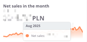
The Net sales in the month indicator presents the value of sales achieved in a given month, including a comparison to the result from the previous period. This makes it easy to quickly assess whether the sales dynamics are increasing or decreasing.
The chart displays:
-
net sales value in the selected month,
-
monthly trend – a line showing changes in sales over time
Thanks to this indicator, the user can easily monitor the current condition of sales and track short-term changes in the company’s performance.
Sales profit in the month
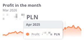
The profit in the month indicator presents the monthly financial result, meaning the difference between sales revenues and the costs of generating them. This makes it possible to continuously monitor how the company generates margin in the short term.
The chart displays:
-
profit achieved in the given month,
-
monthly trend – a line illustrating changes over time
Thanks to this indicator, the user can quickly verify whether sales are profitable in the short term, and detect possible declines or increases in profitability in individual months.
Profit in the month (%)
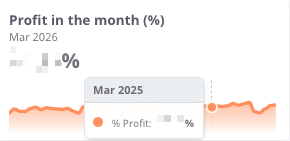
The Profit in the month (%) indicator shows what portion of the revenues achieved in a given month represents profit after deducting costs. It is a key measure of profitability that makes it possible to assess whether the company maintains an appropriate level of operating margin.
The chart presents:
Thanks to this indicator, the user can quickly verify whether the margin remains at a safe level, as well as identify moments when the company operated with higher or lower financial efficiency.
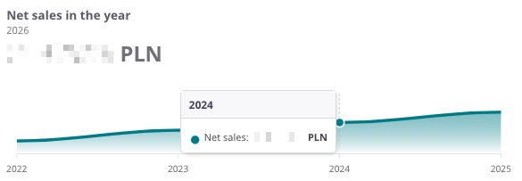
Net sales in the year
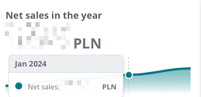
The Net sales in the year indicator presents the total value of sales achieved in a given calendar year. It makes it possible to analyze how the company develops on an annual basis and to compare results between individual years.
The chart presents:
-
net sales value in the given year,
-
time axis – enabling observation of year-to-year changes,
-
sales trend – allowing quick assessment of whether the company is increasing its scale of operations or experiencing sales declines.
Thanks to this indicator, the user gains a complete picture of how the company has been performing over the years, which forms the basis for assessing long-term stability and business growth.
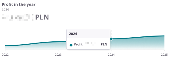
Profit in the year
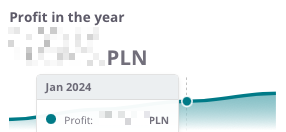
The profit in the year indicator illustrates the company’s annual financial result – that is, the difference between sales revenues and the costs of generating them. This makes it possible to track how the company’s profitability develops on a yearly basis.
The chart presents:
-
the profit value in the given year,
-
time axis, allowing comparison of results year to year,
-
profitability trend, indicating whether the company maintains stable margins, increases profitability, or faces declines.
Thanks to this overview, the user can quickly assess whether the company’s annual financial results confirm its operational efficiency and economic stability.
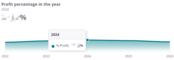
Profit percentage in the year
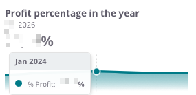
The Profit percentage in the year indicator shows the relationship between profit and sales value on an annual basis, i.e., the profit margin the company achieves on sales. It is a key measure that makes it possible to assess how effectively the company generates profit in relation to its revenues.
The chart presents:
-
the percentage level of profit in the given year,
-
time axis, which allows observation of changes in profitability across individual years,
-
profitability trend, indicating whether the company maintains a stable margin, improves efficiency, or experiences declines.
Thanks to this indicator, the user can easily assess whether the company maintains a satisfactory level of profitability in the long term and compare the dynamics of changes with previous years.
Unsettled value in PLN
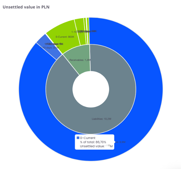
The chart presents the structure of unsettled receivables and liabilities broken down into time intervals. It shows what portion of amounts remains open on the side of receivables (marked in red) and liabilities (marked in blue).
The chart presents:
-
receivables – amounts the company should receive from contractors,
-
liabilities – amounts the company must settle with suppliers,
-
time intervals (0–current, 1–10 days, 11–30 days, 31–60 days, 60> days) – allowing identification of how long values have remained unsettled.
Thanks to this, the user can quickly identify whether the company has a greater issue with recovering receivables or settling liabilities, as well as assess in which time intervals the arrears are accumulating.
Sales by months
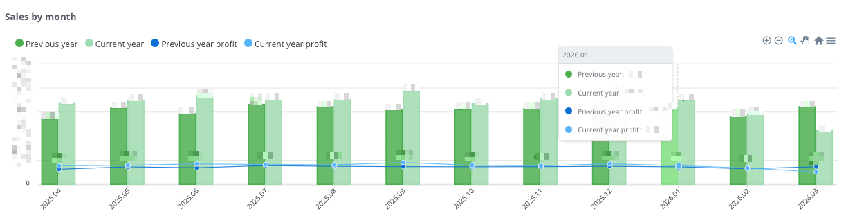
The chart presents a comparison of sales and profits on a monthly basis, showing data from the current year and the previous year. This makes it possible to track seasonal trends and assess how the current results compare with the same months of the previous year.
The chart shows:
-
Dark green columns – sales value for the previous year.
-
Light green columns – sales value for the current year.
-
Dark blue line and points – profit value for the previous year.
-
Light blue line and points – profit value for the current year.
-
Time axis (months) – displays the dynamics of financial changes over the analyzed periods.
With this comparison, the user can:
-
quickly assess whether sales and profit in the current year are higher or lower compared to the previous year,
-
identify periods of growth and decline,
-
analyze the cyclicality of sales and profitability in a monthly breakdown.
Warehouse Value
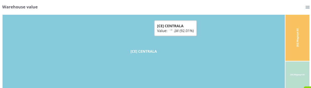
The Warehouse Value chart presents the structure and share of individual locations in the total value of the company's inventory. Thanks to the proportional division of space, the user can instantly assess which warehouses store the largest portion of the capital invested in stock.
The chart presents the following:
Tile size – corresponds to the total value of goods in a given warehouse. The larger the area a given rectangle occupies, the higher the value of the stock located there relative to the total.
Diverse colors – allow for quick visual differentiation between individual warehouses or company branches.
Information labels – contain the warehouse name, its monetary value, and its percentage share in the total stock level of the company.
Thanks to this indicator, the user can instantly verify the allocation of goods within the company structure, which facilitates logistics management and delivery planning, and allows for effective optimization of stock levels in key locations.
Warehouse - Warehouse value summary
The Warehouse tab in cairo.BI is the central area for analyzing inventory levels and stock values. It provides users with a complete overview of warehouse structure, enabling better management of goods and capital tied up in inventory.
In this tab, users can analyze, among other things:
- total warehouse value – broken down into available goods, logistics reservations, and customer reservations,
- values by product groups – identifying which groups generate the highest stock value,
- values by manufacturers – allowing verification of each manufacturer’s share in the warehouse structure,
- stock availability structure – comparing the proportion of available versus reserved items,
- value changes over time – monitoring trends and dynamics across warehouses.
The Warehouse tab in cairo.BI makes it easy to identify where the largest stock reserves are located and which areas are most affected by reservations. As a result, it becomes a key tool supporting efficient inventory management and informed business decision-making.
Warehouse value
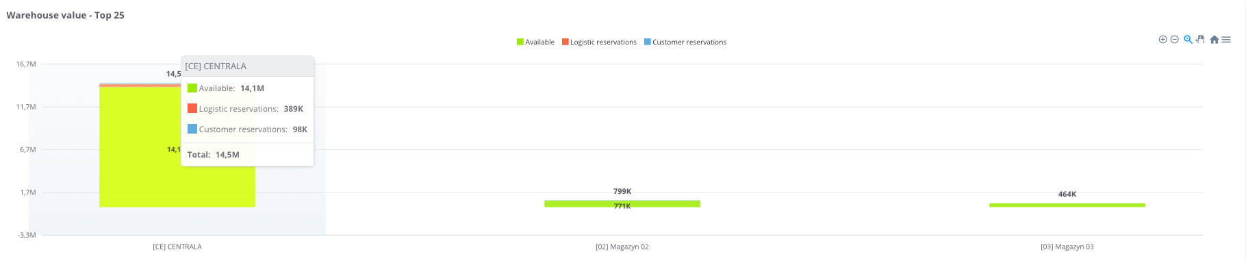
The Warehouse value chart presents the total value of stock across individual warehouses, broken down into:
Thanks to this, it is easy to assess the structure of inventory and the share of reserved items in relation to available stock.
Warehouse value - table
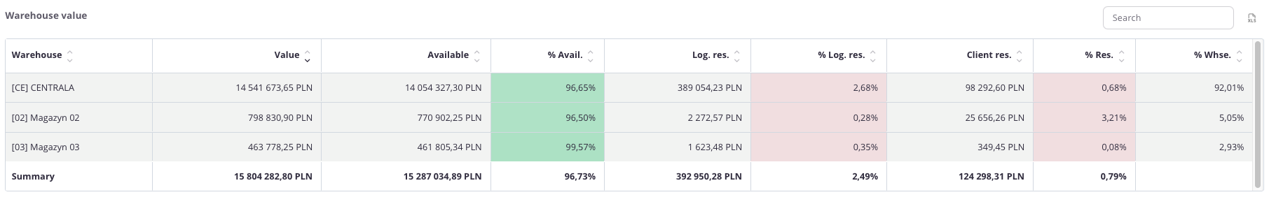
“Warehouse values” table – this summary presents the value of stock in individual warehouses, broken down into:
-
Value,
-
Available value and its percentage share (% Avail.),
-
Logistics reservations value and its percentage share (% Log.res.),
-
Client reservations value and its percentage share (% Res.),
-
Warehouse share in total stock (% Whse.).
The table uses color highlighting for easier interpretation:
-
Green – the more intense the color, the higher the share of goods available for sale,
-
Red – the more intense the color, the greater the share of goods blocked in logistics or customer reservations.
This allows the user to quickly assess not only numerical values but also the proportions between availability and reservations in each warehouse.
The table includes a search field that allows narrowing the view to selected warehouses. In such cases, the summaries automatically adjust to the filtered results.
Additionally, data can be sorted by clicking column headers – for example, to arrange warehouses by total value or reservation percentage.
Warehouse - Warehouse values by product groups
Product group value – Top 25
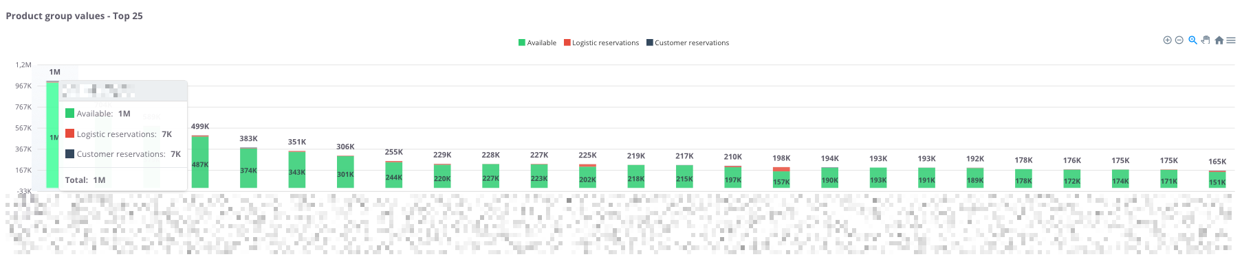
“Product group values – Top 25” – the chart presents the 25 product groups with the highest stock value. For each group, the following components are shown:
-
Available (green) – goods ready for sale,
-
Logistics reservations (red) – stock blocked for logistics processes,
-
Customer reservations (black) – goods reserved for specific orders.
Thanks to this, the chart allows users to quickly assess which product groups generate the highest warehouse value, as well as determine what portion of the stock is available versus reserved.
Product group values – table
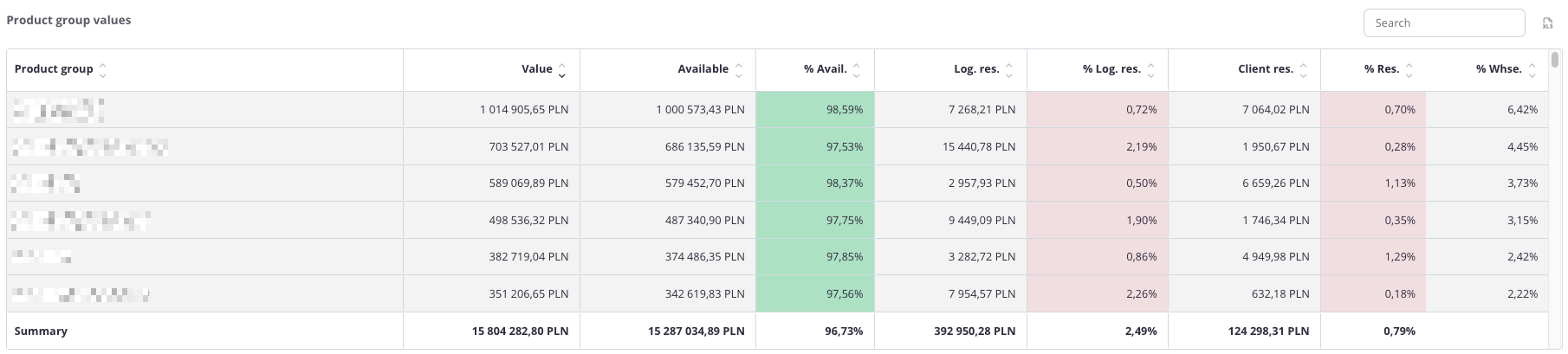
“Product group values – table” – the table presents the value of inventory across individual product groups. For each group, the following data is displayed:
-
Value,
-
Available value and its percentage share (% Avail.),
-
Logistics reservations value and its percentage share (% Log.res.),
-
Client reservations value and its percentage share (% Res.),
-
Group’s percentage share in total warehouse inventory (% Whse.).
The table uses color highlighting:
-
Green – the more intense the color, the higher the share of goods available for sale,
-
Red – the more intense the color, the higher the share of goods blocked in logistics or customer reservations.
Thanks to this, users can quickly assess not only numerical values but also the proportions between availability and reservations within each product group.
The table includes a search field, allowing users to narrow the data to selected groups. In such cases, summaries automatically adjust to the filtered results.
Additionally, data can be sorted by clicking column headers – for example, to arrange groups by total value or percentage share of reservations.
Warehouse - Warehouse values by producers
Value by producers – Top 100
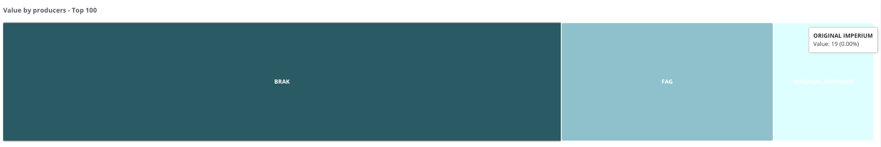
“Value by producers – Top 100” – the chart presents the 100 producers with the highest warehouse stock value.
Each rectangle represents one manufacturer:
-
the size of the field reflects the stock value assigned to that manufacturer,
-
the color distinguishes individual manufacturers from one another.
Thanks to this visualization, it is easy to identify which manufacturers account for the largest share of total warehouse value and to compare their percentage contribution within the overall stock structure.
Value by producers – table
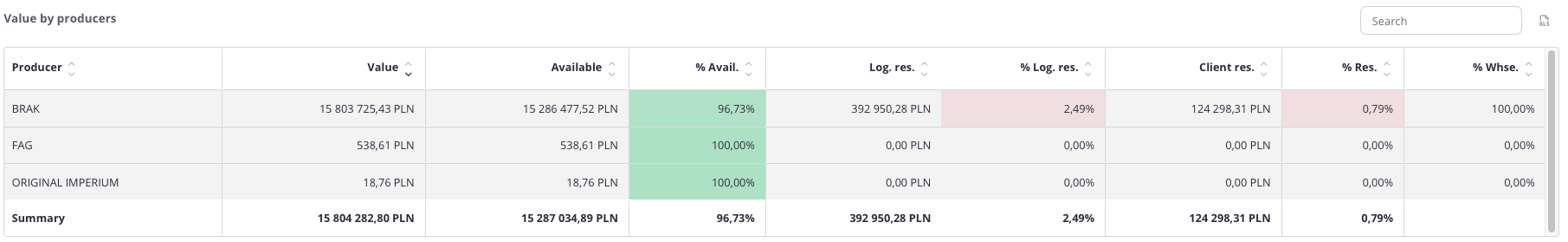
“Value by producers – table” – this summary presents stock values broken down by individual producers. For each manufacturer, the following data is displayed:
-
Value,
-
Available value and its percentage share (% Avail.),
-
Logistics reservations value with its percentage share (% Log.res.),
-
Client reservations value with its percentage share (% Res.),
-
Producer’s percentage share in total warehouse stock (% Whse.).
The table uses color highlighting for easier interpretation:
-
Green – the more intense the color, the higher the share of goods available for sale,
-
Red – the more intense the color, the greater the share of goods blocked in logistics or customer reservations.
This allows the user to quickly assess not only numerical values but also the proportions between available and reserved stock for each manufacturer.
The table includes a search field that allows narrowing the data to selected manufacturers. In such cases, summaries automatically adjust to the filtered results.
Additionally, data can be sorted by clicking column headers – for example, to arrange manufacturers by total value or by the percentage share of reservations.
Settlements - Summary
The Settlements tab in cairo.BI is a tool for monitoring the company’s receivables and liabilities. It enables full control over payments and helps assess their impact on the company’s financial liquidity.
In this tab, users can analyze, among other things:
- receivables and liabilities balance – the company’s current financial balance,
- overdue items – breakdown of settlements by delay periods,
- payment schedule – forecast of future receivables and liabilities over time,
- settlements by contractors – analysis showing which business partners generate the largest receivables and liabilities,
- settlements by currencies – control of balances in PLN, EUR, USD, and other currencies,
- settlements by settlement groups – overview of settlements within defined categories.
The Settlements tab in cairo.BI allows for quick identification of potential risks related to payment delays and assessment of the company’s financial stability. It is a key tool supporting liquidity management and strategic financial decision-making.
All values are converted to PLN according to the exchange rate of the previous day, ensuring consistent presentation regardless of the document currency.
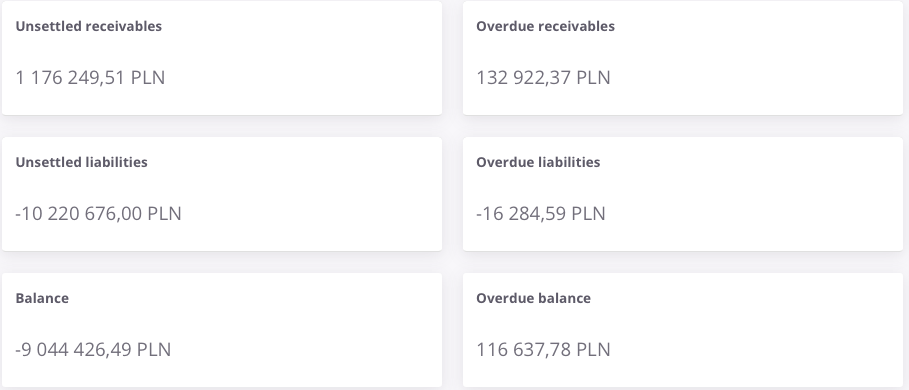
The section presents the key values of receivables and liabilities in a general view. It shows both current and overdue amounts.
The visible fields are:
-
Unsettled receivables – the current value of receivables from contractors that have not yet been paid.
-
Overdue receivables – the portion of receivables for which the payment deadline has been exceeded.
-
Unsettled liabilities – the company’s current obligations that have not yet been settled.
-
Overdue liabilities – liabilities for which the payment deadline has passed.
-
Balance – the difference between unsettled receivables and liabilities.
-
Overdue balance – the difference between receivables and liabilities, taking into account only overdue amounts.
Thanks to this section, the user can quickly assess the current state of settlements and determine whether the company currently has a surplus of receivables or liabilities.
Unsettled by currencies
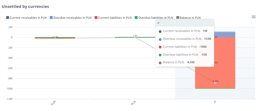
“Unsettled by currencies” – the chart presents the value of unsettled receivables and liabilities broken down by currency.
The following elements are visible:
-
Current receivables in PLN – amounts for which the payment due date has not yet passed,
-
Overdue receivables in PLN– amounts past their payment due date,
-
Current liabilities in PLN – amounts payable to suppliers before the due date,
-
Overdue liabilities in PLN – amounts past their payment due date,
-
Balance in PLN – the difference between receivables and liabilities in a given currency.
Unsettled values by currencies – table
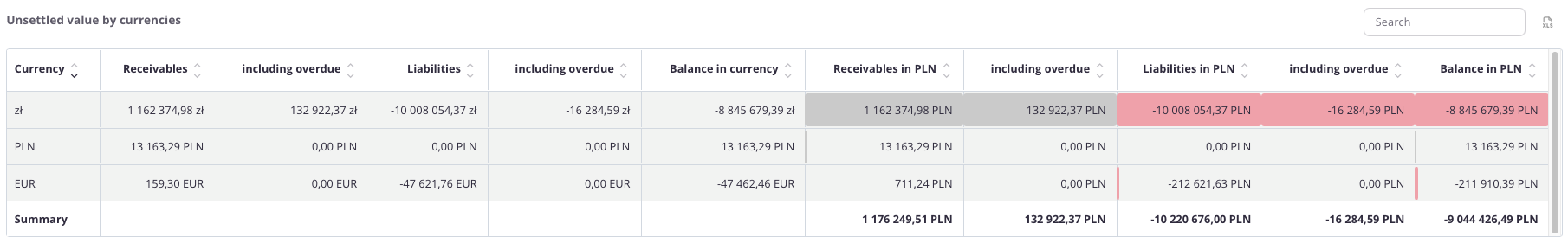
“Unsettled values by currencies – table” – this summary presents receivables and liabilities broken down by individual currencies. For each currency, the following data is displayed:
-
Currency – Indicates the currency in which the settlements are recorded.
-
Receivables – Displays the total current value of receivables in the specified currency.
-
including overdue – The portion of receivables that has exceeded the payment due date.
-
Liabilities – Displays the total current value of liabilities in the specified currency.
-
including overdue – The portion of liabilities that has exceeded the payment due date.
-
Balance in currency – The net difference between total receivables and total liabilities for that currency.
-
Receivables in PLN – The total value of receivables converted into PLN.
-
including overdue – The value of overdue receivables converted into PLN.
-
Liabilities in PLN – The total value of liabilities converted into PLN.
-
including overdue – The value of overdue liabilities converted into PLN.
-
Balance in PLN – The final financial balance for the specific currency, converted into PLN.
The table uses color highlighting:
-
Red bar – its length reflects the volume of liabilities; the longer the bar, the higher the total amount payable.
-
Grey bar – its length corresponds to the volume of receivables; the longer the bar, the higher the total amount due.
This allows the user to quickly assess not only numerical values but also the proportions between receivables and liabilities in each currency, as well as the impact of delays on the balance.
The table includes a search field, which allows narrowing the data to selected currencies. In such cases, summaries automatically adjust to the filtered results.
Additionally, data can be sorted by clicking column headers – for example, to arrange currencies by the amount of receivables, liabilities, or balance.
Settlements - Payment terms
All values are converted to PLN according to the exchange rate of the previous day, ensuring consistent presentation regardless of the document currency.
Unsettled value in PLN
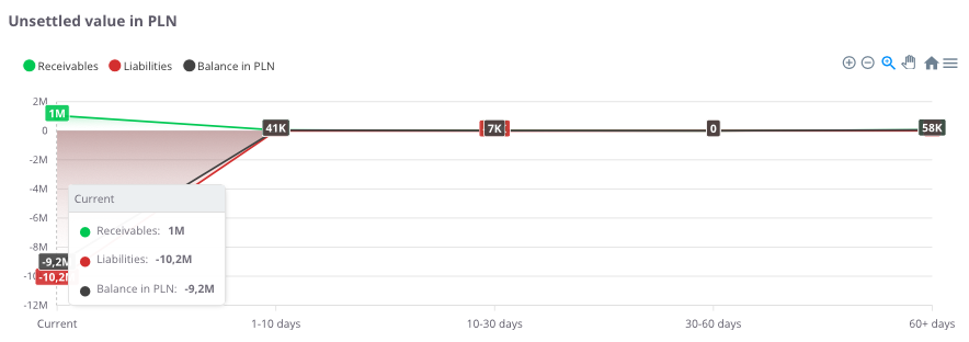
“Unsettled value in PLN” – the chart presents outstanding settlements over time, broken down by overdue periods. This makes it possible to see how the structure of receivables and liabilities changes across different time intervals.
The chart displays:
-
Receivables (green) – amounts expected from contractors that have not yet been settled,
-
Liabilities (red) – amounts the company should pay to suppliers,
-
Balance in PLN (black) – the difference between receivables and liabilities within a given overdue period.
Thanks to this chart, the user can quickly identify whether the company faces a greater issue with delayed payments from customers (receivables) or with its own overdue liabilities.
Unsettled value in PLN – table
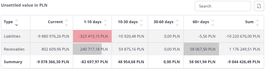
“Unsettled value in PLN – table” – this summary presents outstanding receivables and liabilities broken down by overdue periods. For each category, the following values are displayed:
-
Current – settlements for which the payment term has not yet expired,
-
1–10 days – settlements overdue by up to 10 days,
-
10–30 days – settlements overdue between 10 and 30 days,
-
30–60 days – settlements overdue between 30 and 60 days,
-
60> days – settlements overdue by more than 60 days,
-
Total – the overall value of receivables and liabilities.
The table uses color highlighting:
- Red bar – its length reflects the volume of liabilities; the longer the bar, the higher the total amount payable.
- Grey bar – its length corresponds to the volume of receivables; the longer the bar, the higher the total amount due.
Thanks to this, the user can easily identify which time ranges show the largest payment delays and understand the proportions between receivables and liabilities.
The table includes a search field that allows narrowing the data to selected records. In such cases, summaries automatically adjust to the filtered results.
Additionally, data can be sorted by clicking column headers – for example, to arrange settlements according to values within a selected time range.
Liabilities value in PLN
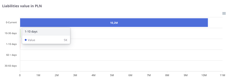
“Liabilities value in PLN” – the chart presents the company’s liabilities broken down by overdue periods. It allows users to check which portion of liabilities is current and which requires immediate attention.
The chart displays:
-
Current – liabilities for which the payment due date has not yet passed,
-
1–10 days – liabilities overdue by up to 10 days,
-
10–30 days – liabilities overdue between 10 and 30 days,
-
30–60 days – liabilities overdue between 30 and 60 days,
-
60> days – liabilities overdue by more than 60 days (the most risky portion of the liabilities portfolio).
Thanks to this, the user can quickly assess where the company’s largest financial burden is concentrated and take appropriate actions to improve liquidity.
Receivables value in PLN
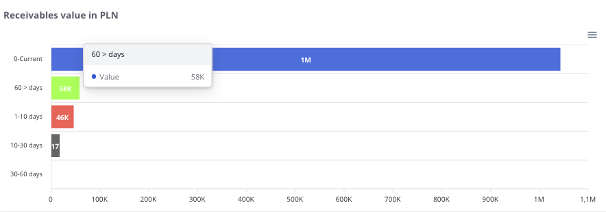
“Receivables value in PLN” – the chart presents the company’s receivables broken down by overdue periods. It allows users to check which portion of receivables is current and which is already past due.
The chart displays:
-
Current – receivables for which the payment due date has not yet passed,
-
1–10 days – receivables overdue by up to 10 days,
-
10–30 days – receivables overdue between 10 and 30 days,
-
30–60 days – receivables overdue between 30 and 60 days,
-
60> days – receivables overdue by more than 60 days (the most risky portion of the receivables portfolio).
Thanks to this, the user can easily assess which receivables require urgent collection actions and what is the risk of delays in incoming payments.
Settlements - Contractors
Receivables in PLN – Top 20
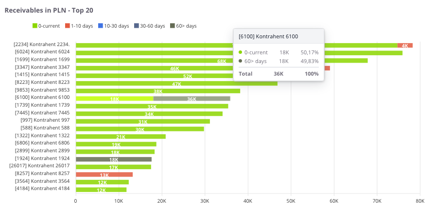
“Receivables in PLN – Top 20” – the chart presents the twenty contractors with the highest value of unsettled receivables. This makes it easy to identify contractors generating the greatest risk of payment delays.
The chart displays:
-
0 – current (green) – receivables for which the payment due date has not yet passed,
-
1–10 days (red) – receivables overdue by up to 10 days,
-
10–30 days (blue) – receivables overdue between 10 and 30 days,
-
30–60 days (navy blue) – receivables overdue between 30 and 60 days,
-
60> days (gray) – receivables overdue by more than 60 days (the most risky portion of the receivables portfolio).
Thanks to this chart, the user can not only identify key contractors with outstanding payments but also check how long individual receivables have remained unsettled.
Liabilities in PLN – Top 20
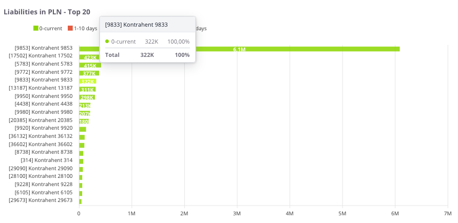
“Liabilities in PLN – Top 20” – the chart presents the twenty contractors with the highest value of unsettled liabilities. This makes it possible to quickly identify the entities to which the company owes the largest amounts.
The chart displays:
-
0 – current (green) – liabilities for which the payment due date has not yet passed,
-
1–10 days (red) – liabilities overdue by up to 10 days,
-
10–30 days (blue) – liabilities overdue between 10 and 30 days,
-
30–60 days (navy blue) – liabilities overdue between 30 and 60 days,
-
60> days (gray) – liabilities overdue by more than 60 days (the most risky portion of the liabilities portfolio).
Thanks to this chart, the user can not only identify contractors to whom the company owes the most, but also check how long individual liabilities have remained unsettled.
Unsettled by contractors in PLN – table
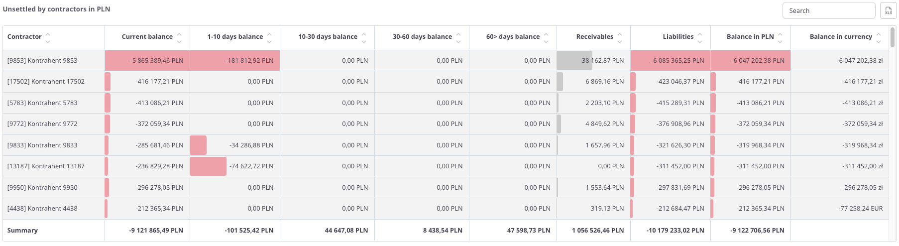
“Unsettled by contractors in PLN – table” – this summary presents detailed data on receivables and liabilities broken down by individual contractors. For each contractor, the following values are displayed:
-
Current balance – settlements for which the payment term has not yet expired,
-
1–10 days balance – settlements overdue by up to 10 days,
-
10–30 days balance – settlements overdue between 10 and 30 days,
-
30–60 days balance – settlements overdue between 30 and 60 days,
-
60> days balance – settlements overdue by more than 60 days,
-
Receivables – the amount the contractor should pay to the company,
-
Liabilities – the amount the company should pay to the contractor,
-
Balance in PLN – the difference between receivables and liabilities,
-
Balance in currency – the balance converted according to the settlement currency.
The table uses color highlighting:
- Red bar – its length reflects the volume of liabilities; the longer the bar, the higher the total amount payable.
- Grey bar – its length corresponds to the volume of receivables; the longer the bar, the higher the total amount due.
Thanks to this, the user can quickly identify contractors with the largest outstanding balances and review the structure of overdue settlements.
The table includes a search field that allows narrowing the data to selected contractors. In such cases, summaries automatically adjust to the filtered results.
Additionally, data can be sorted by clicking column headers – for example, to arrange contractors by the value of the 60+ days balance or the total balance.
Settlements - Warehouses
Unsettled value by warehouse in PLN – table
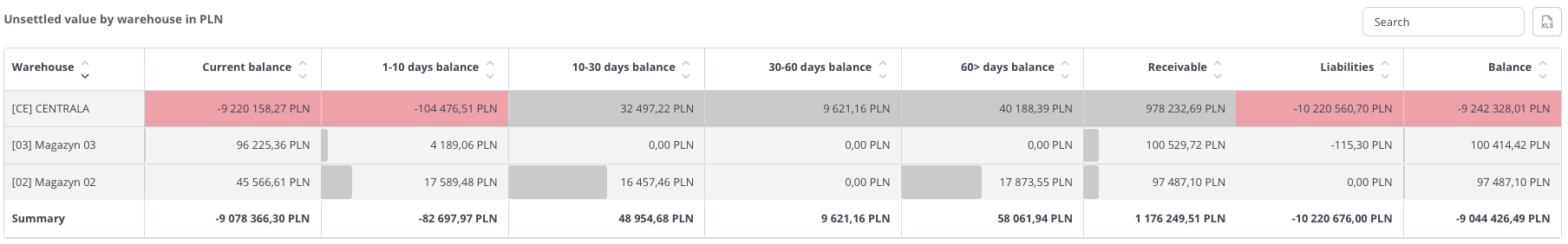
“Unsettled value by warehouse in PLN – table” – this summary presents receivables and liabilities broken down by individual warehouses. For each warehouse, the following data is displayed:
-
Current balance – settlements for which the payment due date has not yet passed,
-
1–10 days balance – settlements overdue by up to 10 days,
-
10–30 days balance – settlements overdue between 10 and 30 days,
-
30–60 days balance – settlements overdue between 30 and 60 days,
-
60> days balance – settlements overdue by more than 60 days,
-
Receivables – the total value of receivables assigned to the warehouse,
-
Liabilities – the total value of liabilities assigned to the warehouse,
-
Balance – the difference between receivables and liabilities.
The table uses color highlighting:
- Red bar – its length reflects the volume of liabilities; the longer the bar, the higher the total amount payable.
- Grey bar – its length corresponds to the volume of receivables; the longer the bar, the higher the total amount due.
Thanks to this, the user can quickly identify warehouses with the largest overdue liabilities (values below zero) and see positive balance values (above zero).
The table includes a search field that allows narrowing the data to selected warehouses. In such cases, summaries automatically adjust to the filtered results.
Additionally, data can be sorted by clicking the column headers – for example, to arrange warehouses by balance value or by the amount of liabilities.
Receivables in PLN
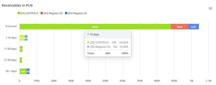
“Receivables in PLN” – the chart presents the value of receivables broken down by warehouses. Each warehouse is marked with a different color, allowing for a quick assessment of its share in the total amount of receivables.
The chart also includes time intervals for overdue receivables:
-
0 – current – receivables for which the payment due date has not yet passed,
-
1–10 days – receivables overdue by up to 10 days,
-
10–30 days – receivables overdue between 10 and 30 days,
-
30–60 days – receivables overdue between 30 and 60 days,
-
60> days – receivables overdue by more than 60 days (the most risky portion of the receivables portfolio).
Thanks to this, the chart allows users not only to compare receivable loads between warehouses but also to analyze the structure of overdue amounts.
Liabilities in PLN
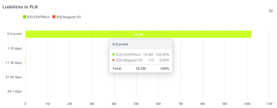
“Liabilities in PLN” – the chart presents the value of liabilities broken down by warehouses. Each warehouse is marked with a different color, allowing comparison of their share in the total amount of liabilities.
The chart also includes time intervals for overdue liabilities:
Thanks to this, the chart allows users to assess which warehouses account for the highest liability values and how their structure changes over time.
Settlements - Payment schedule
Payment schedule – 21 days in PLN
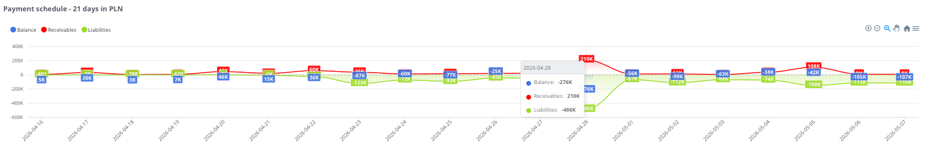
“Payment schedule – 21 days in PLN” – the chart presents a forecast of financial flows for the next 21 days. It allows users to assess how the company’s payment schedule is shaping up and on which days a cash surplus or shortage may occur.
The chart displays:
-
Receivables (red) – amounts expected from contractors in the coming days,
-
Liabilities (green) – amounts the company should settle in the following days,
-
Balance (blue) – the difference between receivables and liabilities on a given day.
Thanks to this chart, the user can quickly assess which days will bring the highest payment burdens and when inflows are expected, enabling more effective financial liquidity planning.
Payment schedule – 21 days in PLN – table
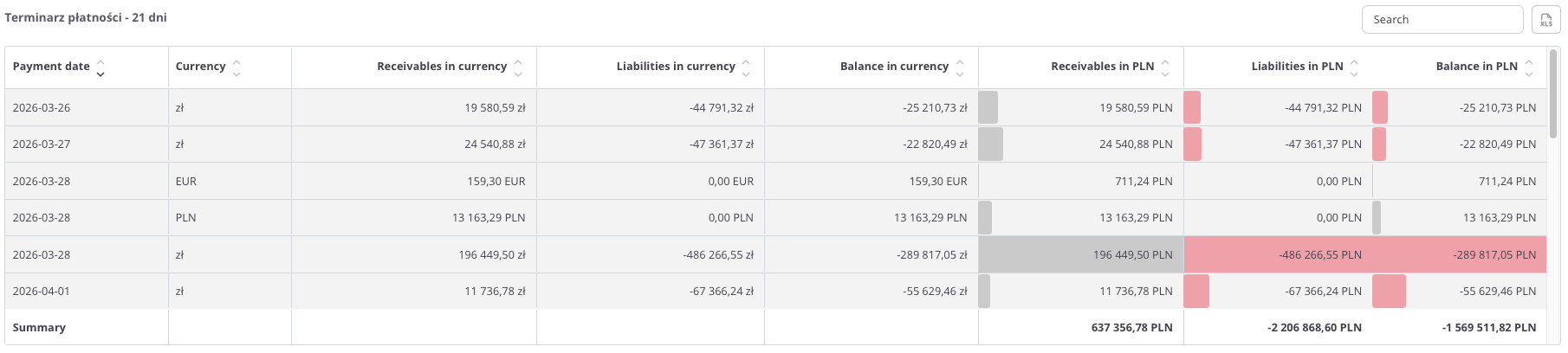
“Payment schedule – 21 days in PLN – table” – this summary presents a forecast of receivables and liabilities for the next 21 days, broken down by currencies.
The table includes the following fields:
-
Payment date – the day on which the payment is scheduled,
-
Currency – the settlement currency of the payment,
-
Receivables in currency – expected inflows,
-
Liabilities in currency – planned outflows,
-
Balance in currency – the difference between receivables and liabilities,
-
Receivables in PLN – receivable values converted into PLN,
-
Liabilities in PLN – liability values converted into PLN,
-
Balance in PLN – the final difference between receivables and liabilities in PLN.
The table uses color highlighting:
- Red bar – its length reflects the volume of liabilities; the longer the bar, the higher the total amount payable.
-
Grey bar – its length corresponds to the volume of receivables; the longer the bar, the higher the total amount due.
Thanks to this, the table allows users to check on which days and in which currencies financial surpluses or deficits may occur, as well as to analyze the balance after conversion to PLN.
The table includes a search field, allowing data to be narrowed to selected dates or currencies. In such cases, summaries automatically adjust to the filtered results.
Additionally, data can be sorted by clicking column headers – for example, to arrange payments by date, currency, or balance value.
Settlements - Settlement groups
Unsettled value by groups in PLN
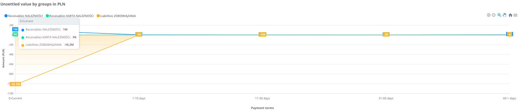
“Unsettled value by groups in PLN” – the chart presents receivables and liabilities broken down by settlement groups and overdue periods. This makes it possible to see how values are distributed across different categories and in which time ranges the largest delays occur.
The chart displays:
-
Liabilities – amounts the company should settle,
-
Receivables – amounts expected from contractors.
The data is divided into the following time intervals:
-
0 – current – settlements for which the payment due date has not yet passed,
-
1–10 days – settlements overdue by up to 10 days,
-
11–30 days – settlements overdue between 11 and 30 days,
-
31–60 days – settlements overdue between 31 and 60 days,
-
60> days – settlements overdue by more than 60 days.
Thanks to this chart, the user can easily assess which settlement groups generate the largest receivables and liabilities, as well as how their structure is distributed by overdue period.
Unsettled value by groups in PLN - table
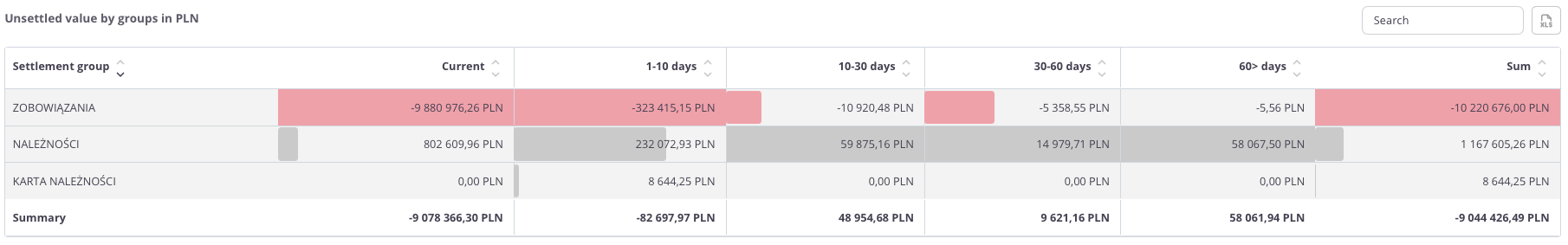
“Unsettled value by groups in PLN – table” – this summary presents receivables and liabilities broken down by settlement groups. This allows users to analyze which groups generate the largest burdens and how delays are distributed over time.
The table includes the following fields:
-
Settlement group – the category to which the settlements are assigned,
-
Current – settlements for which the payment due date has not yet passed,
-
1–10 days – settlements overdue by up to 10 days,
-
10–30 days – settlements overdue between 11 and 30 days,
-
30–60 days – settlements overdue between 31 and 60 days,
-
60> days – settlements overdue by more than 60 days,
-
Sum – the total value of settlements in the given group.
The table uses color highlighting:
- Red bar – its length reflects the volume of liabilities; the longer the bar, the higher the total amount payable.
- Grey bar – its length corresponds to the volume of receivables; the longer the bar, the higher the total amount due.
-
Thanks to this, the user can quickly identify settlement groups with the largest overdue amounts and assess the balance between receivables and liabilities over time.
The table includes a search field that allows narrowing the data to selected groups. In such cases, summaries automatically adjust to the filtered results.
Sales - Annual summary
The Sales tab in cairo.BI provides a clear and structured way to analyze the company’s sales performance. Data is presented through intuitive charts and tables, allowing users to quickly identify key trends.
With this tab, users can assess, among other things:
- sales value across different time periods,
- key contractors generating the highest turnover,
- products and product groups with the greatest impact on sales,
- sales by manufacturers, showing brand contribution to total revenue,
- sales dynamics over time, enabling period-to-period comparisons.
The Sales tab offers a comprehensive overview of how the company sells its products and which factors influence performance. It serves as a powerful tool supporting data-driven business decisions and quick responses to changing market conditions.
All values are calculated based on sales documents (WZ, PG, GP, ZW).
All values are converted to PLN according to the exchange rate of the previous day, ensuring consistent presentation regardless of the document currency.
Net sales in the year
“Net sales in the year” – the chart presents the annual sales value in both historical and current perspectives. It allows users to assess how sales have evolved over the years and compare the dynamics of changes between periods.
The chart displays:
-
Sales value in a given year – the total sum of all sales documents recorded for the selected year,
-
Timeline axis – enabling comparison of values across consecutive years.
Thanks to this chart, users can quickly identify annual sales trends and pinpoint the years in which sales increased or decreased.
Profit in the year
“Profit in the year” – the chart presents the annual profit generated from sales. It allows users to assess how the company’s financial results have evolved over the years and whether it achieved higher or lower margins in different periods.
The chart displays:
-
Profit from sales in a given year – total sales revenue minus costs,
-
Timeline axis – enabling year-to-year comparison of results.
Thanks to this chart, users can easily analyze profitability trends in sales and determine whether the company is moving toward greater financial efficiency.
Profit percentage in the year
“Profit percentage in the year” – the chart presents the sales profit margin in annual terms. It allows users to assess how sales profitability has evolved over the years.
The chart displays:
-
Profit percentage in a given year – the share of profit in total sales value,
-
Timeline axis – enabling comparison of results across consecutive years.
Thanks to this chart, users can easily track profitability trends and determine whether the company maintains a stable profit margin or experiences fluctuations over time.
Sales and profit by years
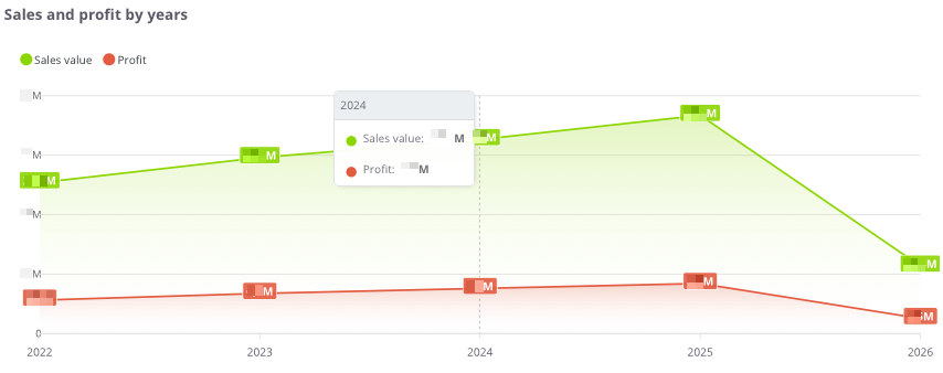
“Sales and profit by years” – the chart presents the sales value and profit in annual terms. It allows users to assess how the scale of sales has changed and whether the increase in sales corresponds with growth in profitability.
The chart displays:
-
Sales value (green) – total sales in a given year,
-
Profit (red) – financial result from sales in a given year,
-
Timeline axis – comparison of results across consecutive years.
Thanks to this chart, users can easily analyze the relationship between sales and profit and determine whether the company is developing in a balanced and profitable manner.
Sales and profit by years - table
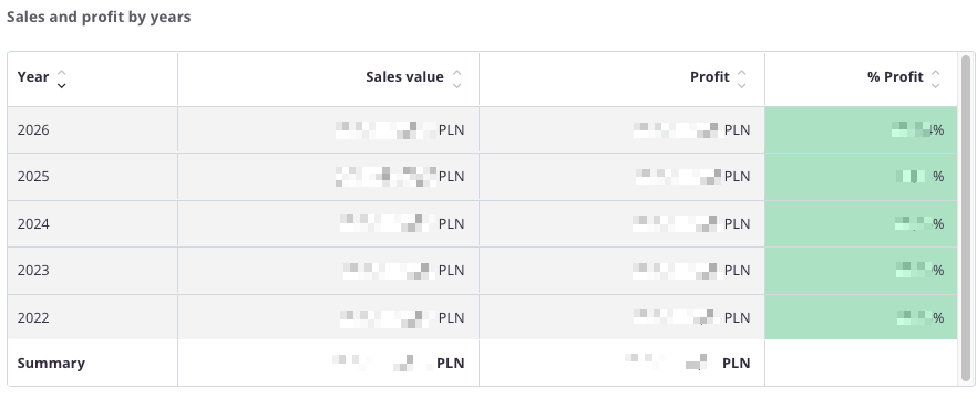
“Sales and profit by years – table” – this summary presents annual sales data, allowing comparison of results over multiple years.
The table includes the following fields:
-
Year – the analyzed period,
-
Sales value – total sales in a given year,
-
Profit – financial result from sales,
-
% Profit – percentage share of profit in total sales value.
The table uses color highlighting:
-
Green – the more intense the color, the higher the share of profit in total sales,
-
Red – indicates a negative financial result, i.e., a loss.
Thanks to this, the user can quickly compare sales values, profits, and profitability percentages across years and assess whether the company maintains a stable level of profitability.
The table includes a search field that allows narrowing the data to selected years. In such cases, summaries automatically adjust to the filtered results.
Additionally, data can be sorted by clicking column headers – for example, to arrange years by sales value or profitability level.
Sales - Monthly analysis
All values are calculated based on sales documents (WZ, PG, GP, ZW).
All values are converted to PLN according to the exchange rate of the previous day, ensuring consistent presentation regardless of the document currency.
Net sales in the month
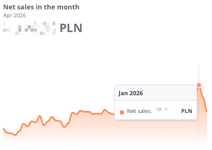
“Net sales in the month” – the chart presents the net sales value by month. It allows users to assess how sales have changed over time and compare results month by month.
The chart displays:
-
Net sales – the total sales value for the given month,
-
Timeline axis – enabling analysis of sales across consecutive months,
Thanks to this chart, users can easily track monthly sales trends, quickly identifying periods of growth or decline, which helps in responding promptly to market changes.
Profit in the month
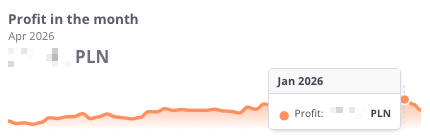
“Profit in the month” – the chart presents the financial result from sales by month. It allows users to assess how net profit evolved and how it changed from month to month.
The chart displays:
-
Profit in a given month – the difference between sales and costs,
-
Timeline axis – enabling analysis of profits over consecutive months,
Thanks to this chart, users can easily track monthly profitability trends and identify periods of higher or lower financial performance.
Profit in the month (%)
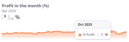
“Profit in the month (%)” – the chart presents the percentage profitability of sales by month. It allows users to assess how the net profit margin has evolved month by month.
The chart displays:
-
% Profit in a given month – the share of profit in total sales value,
-
Timeline axis – enabling analysis of profitability across consecutive months,
Thanks to this chart, users can quickly verify whether the company maintains a stable profit margin or if there are visible fluctuations over time.
Profit – previous month
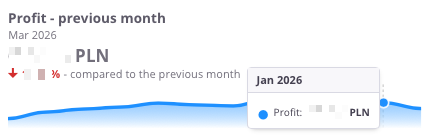
“Profit – previous month” – the chart presents the financial result from sales compared with the previous month. It allows users to see how profitability has changed month by month.
The chart displays:
-
Profit in a given month – the difference between sales and costs,
-
Timeline axis – showing profits across consecutive months,
-
Comparison with the previous month – indicating whether profit increased or decreased compared to the earlier period.
Thanks to this chart, users can quickly assess profitability trends and respond promptly to improvements or declines in financial performance.
Profit – previous month (%)
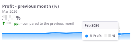
"Profit – previous month (%)” – the chart presents the percentage sales profitability compared with the previous month. It allows users to assess how the net profit margin has changed month by month.
The chart displays:
Thanks to this chart, users can quickly check whether the company maintains stable sales profitability or experiences noticeable month-to-month fluctuations.
Net sales – previous month
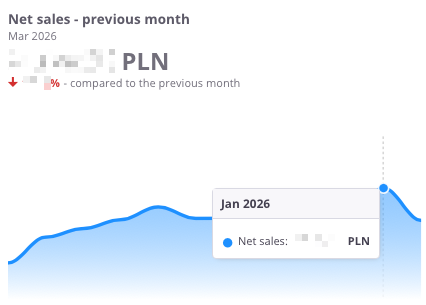
“Net sales – previous month” – the chart presents the net sales value compared with the previous month. It allows users to assess how sales have changed month by month.
The chart displays:
-
Net sales in a given month – the total sales value,
-
Timeline axis – showing sales across consecutive months,
-
Comparison with the previous month – indicating whether sales increased or decreased compared to the earlier period.
Thanks to this chart, users can quickly see the trend in net sales and determine whether the company maintains steady growth or experiences declines.
Sales by months
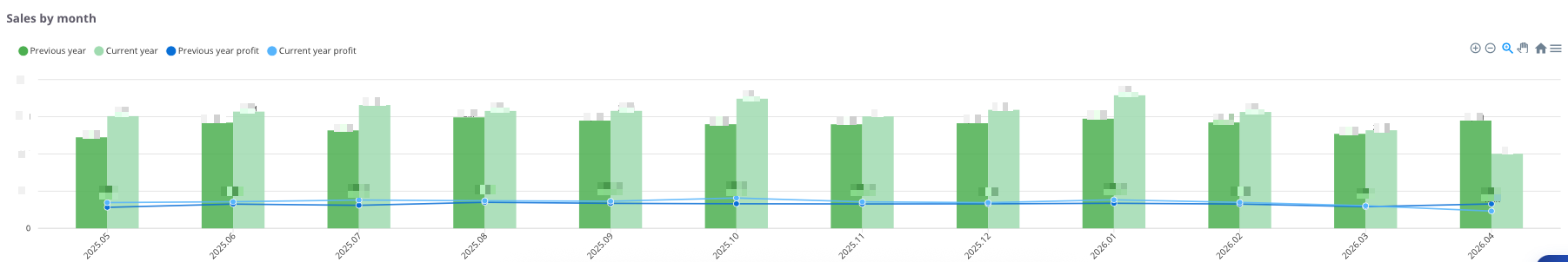
“Sales by months” – the chart presents the sales value and profit on a monthly basis, divided into the current year and the previous year. This makes it possible to compare how results have developed across the same months in two different periods.
The chart displays:
-
Previous year (green) – sales values for each month of the previous year,
-
Previous year profit (blue) – profit achieved in each month of the previous year,
-
Current year (light green) – sales values for each month of the current year,
-
Current year profit (light blue) – profit achieved in each month of the current year.
Thanks to this chart, users can easily analyze changes in sales and profit over time and compare whether the current year performs better, worse, or similarly to the previous one across individual months.
Sales - Sales by warehouses
All values are calculated based on sales documents (WZ, PG, GP, ZW).
All values are converted to PLN according to the exchange rate of the previous day, ensuring consistent presentation regardless of the document currency.
Sales by warehouse
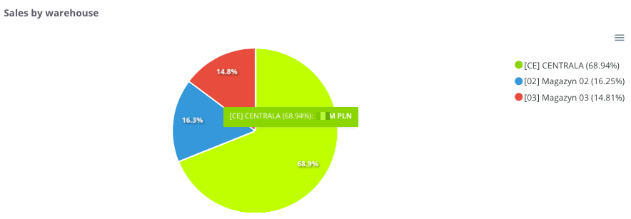
“Sales by warehouse” – the chart presents the share of sales broken down by individual warehouses. It allows users to see which warehouse generates the largest contribution to the company’s total sales.
The chart displays:
-
Individual warehouses – each marked with a different color,
-
Percentage share of sales – showing what portion of total sales each warehouse represents.
Thanks to this chart, users can easily compare sales structures by warehouse location and identify which warehouses play a key role in overall sales performance.
Sales by warehouse - table
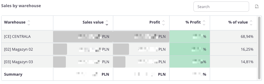
“Sales by warehouse – table” – this summary presents sales data broken down by individual warehouses. It allows users to see how each warehouse contributes to the company’s total sales and profit.
The table includes the following fields:
-
Warehouse – name of the warehouse,
-
Sales value – total sales completed through the given warehouse,
-
Profit – financial result generated by sales from that warehouse,
-
% Profit – percentage share of profit in total sales value,
-
% Value – percentage share of the warehouse in total company sales.
The table uses color highlighting:
-
Green – the more intense the color, the higher the profit percentage,
-
Red – indicates negative values, representing a loss.
- Grey bar – its length corresponds to the scale of the value; the longer the bar, the higher the sales or profit amount.
Thanks to this, the user can quickly compare the profitability of sales across different warehouses and evaluate their share in total sales structure.
The table includes a search field that allows narrowing the data to selected warehouses. In such cases, summaries automatically adjust to the filtered results.
Additionally, data can be sorted by clicking column headers – for example, to arrange warehouses by sales value, profit, or profitability.
Sales by warehouse in the last 12 months - Top 5
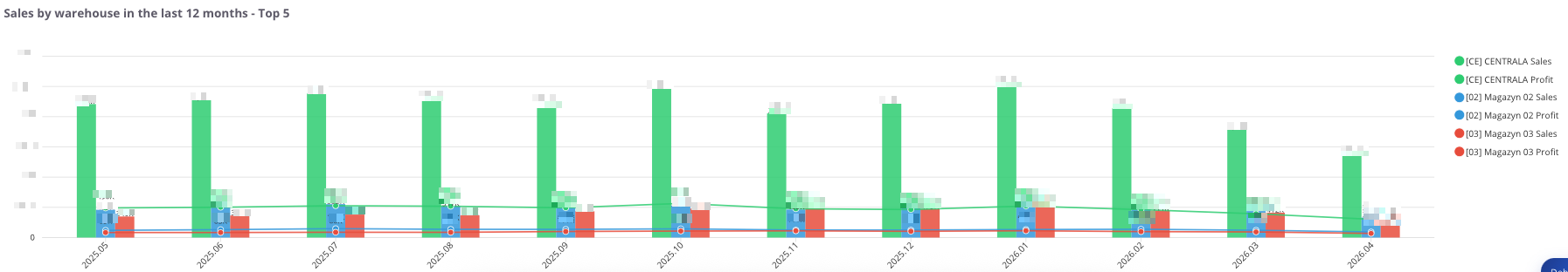
“Sales by warehouse in the last 12 months - Top 5” – the chart presents the sales value and profit broken down by individual warehouses and monthly periods. It allows users to track how results have changed over time and which warehouses contributed the most to overall sales.
The chart displays:
-
Sales – total sales value assigned to each warehouse,
-
Profit – financial result generated from that sales volume,
-
Timeline axis – enabling month-by-month analysis,
-
Comparison between warehouses – showing which warehouse generated higher revenue and profit in a given period.
Thanks to this chart, users can easily assess sales and profitability trends and determine whether warehouse performance is stable, increasing, or declining over time.
Sales - Sales by countries
All values are calculated based on sales documents (WZ, PG, GP, ZW).
All values are converted to PLN according to the exchange rate of the previous day, ensuring consistent presentation regardless of the document currency.
Sales by countries
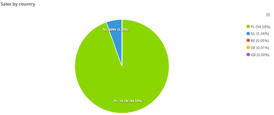
“Sales by country” – the chart presents the share of sales broken down by countries where the company operates. It allows users to see which markets generate the highest revenue.
The chart displays:
Thanks to this, users can easily identify which market is dominant and which countries play a smaller role in the overall sales structure.
Sales by country - table
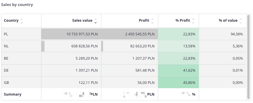
“Sales by country – table” – this summary presents sales data broken down by countries. It allows users to identify which markets generate the highest sales and profit values, and which have less significance in the overall structure.
The table includes the following fields:
-
Country – name of the country,
-
Sales value – total sales made in the given market,
-
Profit – financial result generated by sales in that country,
-
% Profit – percentage share of profit in total sales value,
-
% Value – percentage share of the country in total company sales.
The table uses color highlighting:
-
Green – the more intense the color, the higher the profit percentage,
-
Red – indicates negative values, representing a loss.
The table includes a search field, allowing users to narrow the data to selected countries. In such cases, summaries automatically adjust to the filtered results.
Additionally, data can be sorted by clicking column headers – for example, to arrange countries by sales value, profit, or profitability.
Sales - Sales by contractors
All values are calculated based on sales documents (WZ, PG, GP, ZW).
All values are converted to PLN according to the exchange rate of the previous day, ensuring consistent presentation regardless of the document currency.
Sales by contractors
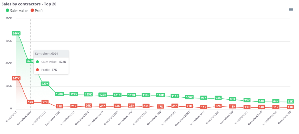
“Sales by contractors – Top 20” – the chart presents the 20 contractors with the highest sales value, along with their corresponding profit. This makes it possible to quickly identify key clients and understand their importance within the company’s revenue structure.
The chart displays:
-
Sales value (green) – total sales made for each contractor,
-
Profit (red) – financial result achieved from cooperation with each contractor,
-
X-axis – list of contractors,
-
Y-axis – sales and profit values.
Thanks to this chart, users can easily compare which contractors generate the highest revenue and profit, as well as assess the gap between sales and profitability in relationships with individual clients.
Sales by contractors - Top 500
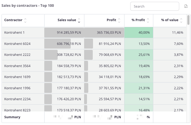
“Sales by contractors – Top 500” – the table presents a list of contractors with the highest sales value, along with the corresponding profit. This allows for a detailed analysis of which clients have the greatest impact on the company’s revenue and profitability.
The table includes the following fields:
-
Contractor – name of the contractor,
-
Sales – total sales value for the given client,
-
Profit – financial result achieved from cooperation,
-
% Profit – percentage share of profit in total sales,
-
% Value – percentage share of the contractor in total company sales.
The table uses color highlighting:
-
Green – the more intense the color, the higher the profit percentage,
-
Red – would indicate negative values, representing a loss.
The table includes a search field, allowing data to be narrowed to selected contractors. In such cases, summaries automatically adjust to the filtered results.
Additionally, data can be sorted by clicking column headers – for example, to arrange contractors by sales value, profit, or profitability.
Thanks to this, users can easily identify the most important clients and assess how significantly they influence the company’s overall sales and profit.
Sales - Sales by routes
All values are calculated based on sales documents (WZ, PG, GP, ZW).
All values are converted to PLN according to the exchange rate of the previous day, ensuring consistent presentation regardless of the document currency.
Sales by routes
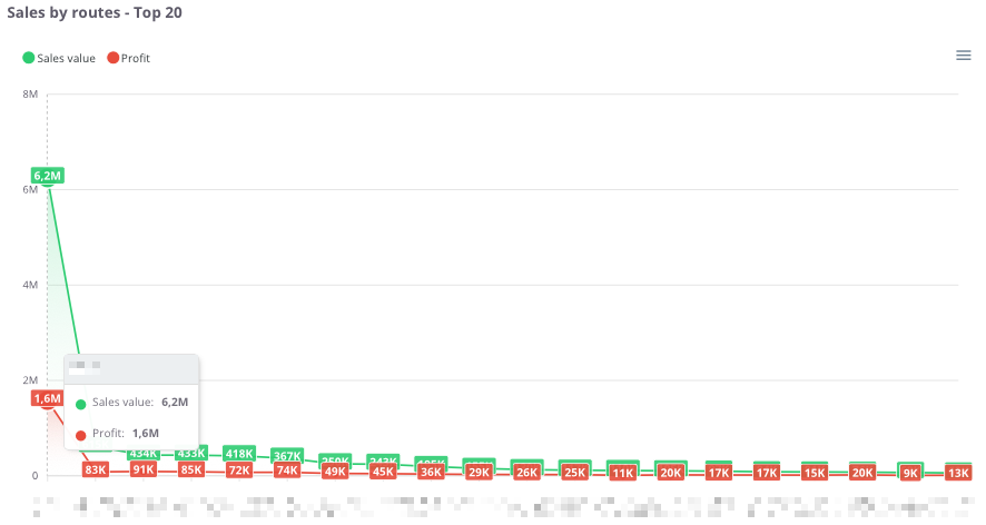
“Sales by routes – Top 20” – the chart presents the 20 routes with the highest sales value, along with the corresponding profit. This makes it possible to identify which routes are the most profitable and how their profitability levels compare.
The chart displays:
Thanks to this chart, users can easily compare which routes generate the highest revenue, as well as assess whether the profit share is proportional to the sales value.
Sales by routes - table
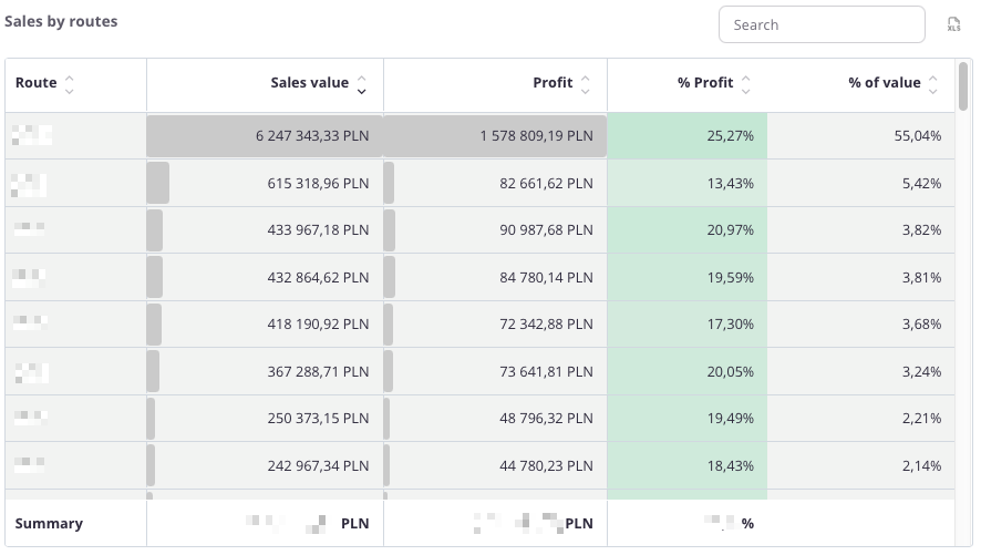
“Sales by routes – table” – this summary presents sales data broken down by individual routes. It allows users to identify which routes generate the highest revenue and profit, as well as assess their share in total company sales.
The table includes the following fields:
The table uses color highlighting:
The table includes a search field, allowing users to narrow the data to selected routes. In such cases, summaries automatically adjust to the filtered results.
Additionally, data can be sorted by clicking column headers – for example, to arrange routes by sales value, profit, or profitability.
Thanks to this, users can easily identify the most profitable routes and understand their importance within the company’s overall sales structure.
Sales - Sales by commercial documents groups
All values are calculated based on sales documents (DD, WZ (which were not created as a result of conversion from DD), PG, GP, ZW).
All values are converted to PLN according to the exchange rate of the previous day, ensuring a consistent presentation regardless of the document currency.
Sales by GDH – Top 20
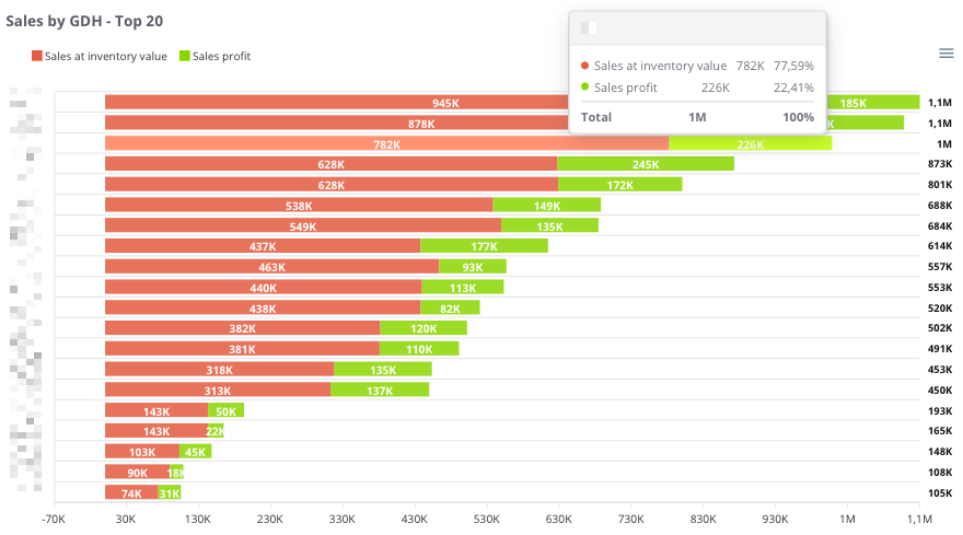
“Sales by GDH – Top 20” – the chart presents the 20 main trade groups (GDH), showing both the recorded sales value and the sales profit. This allows users to assess which groups generate the highest revenue and what their profitability levels are.
The chart displays:
-
Recorded sales (red) – the sales value assigned to a given trade group,
-
Sales profit (green) – the financial result achieved within that group,
-
X-axis – sales and profit values,
-
Y-axis – individual trade groups (GDH).
Thanks to this chart, users can easily compare which trade groups generate the highest turnover and determine whether high sales translate into proportional profit.
Sales by GDH – table
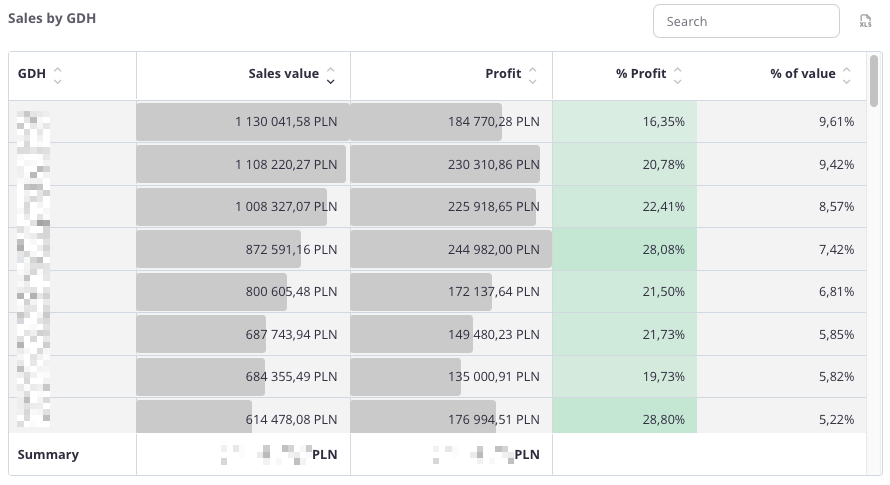
“Sales by GDH – table” – the table presents sales data broken down by trade groups (GDH). It allows users to identify which groups generate the highest sales and profit and assess their share in the company’s total sales structure.
The table includes the following fields:
-
GDH – trade group identifier,
-
Sales value – total sales assigned to the group,
-
Profit – financial result achieved within that group,
-
% Profit – percentage share of profit in total sales value,
-
% Value – percentage share of the trade group in the company’s total sales.
The table uses color highlighting:
-
Green – the more intense the color, the higher the percentage of profit,
-
Red – indicates negative values, representing a loss.
The table includes a search field, allowing users to narrow the data to selected trade groups. In such cases, summaries automatically adjust to the filtered results.
Additionally, data can be sorted by clicking column headers – for example, to arrange groups by sales value, profit, or profitability.
Thanks to this, users can easily identify the most important trade groups and evaluate their impact on the company’s sales and profitability.
Purchases - Annual summary
The Purchases tab presents summaries related to expenses for goods and services. It allows users to control the structure of purchasing costs, monitor their dynamics over time, and assess which suppliers have the largest share in the company’s total purchases.
With the analyses available in this tab, users can:
- review the value of purchases over time – for example, monthly or annually,
- compare expenses across different product groups,
- analyze purchases by suppliers – to identify key business partners,
- verify the share of individual warehouses in total purchases,
- assess the contribution of countries or regions from which deliveries are made.
The Purchases tab enables ongoing monitoring of how procurement costs evolve, where the largest expenses occur, and how the purchase structure looks in terms of suppliers, products, and locations.
Thanks to this, users gain a comprehensive view of which purchases are critical to the company’s operations and which may require cost optimization.
All values are calculated based on purchase documents (PZ, P-).
All values are converted to PLN according to the exchange rate of the previous day, ensuring a consistent presentation regardless of the document currency.
Purchase value in the year
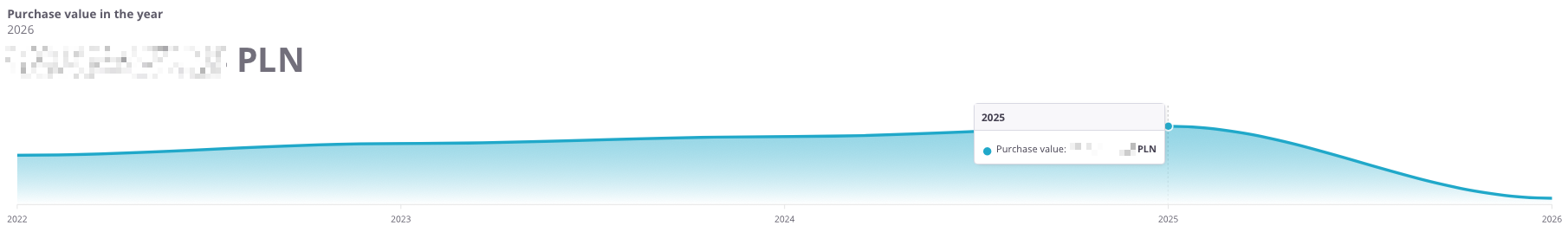
“Purchase value in the year” – the chart presents the annual value of the company’s purchases. It allows users to analyze how purchase costs have evolved over the years and determine whether they show an upward or downward trend.
The chart displays:
-
Purchase value in a given year – total expenditure on purchases during the selected period,
-
Timeline axis – enabling year-to-year comparison of data.
Thanks to this chart, users can easily identify trends in purchasing costs and assess whether expenses remain stable or are subject to greater fluctuations.
Purchases by years
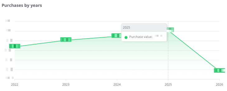
“Purchases by years” – the chart presents the total value of purchases on an annual basis, allowing the analysis of the company’s spending dynamics over recent years.
The chart shows:
-
purchase values by year – the total amount spent on goods and services,
-
timeline axis – enabling year-to-year comparison of changes,
-
purchase trend line – illustrating increases or decreases in costs over the years.
Thanks to this chart, users can easily assess whether the company’s purchase expenses are rising, declining, or remaining stable, providing a solid foundation for further cost analysis and budget planning.
Purchases by years – table
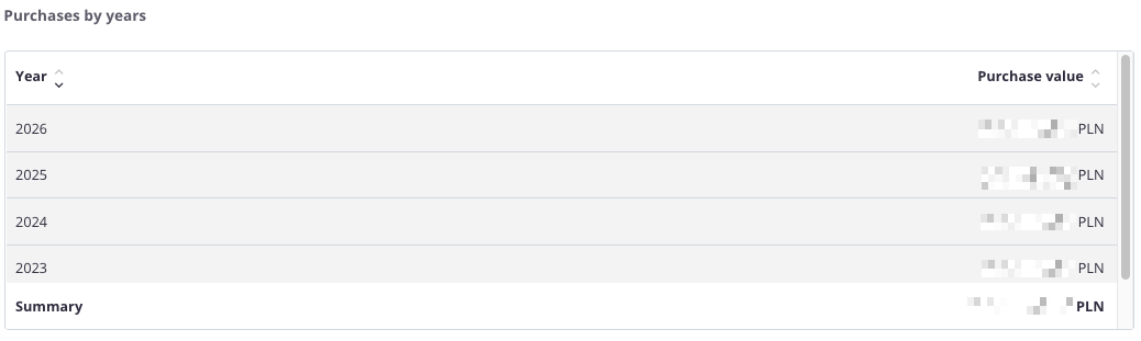
“Purchases by years – table” – the table presents the value of purchases for each year, allowing users to review how purchasing costs have changed over time and what the total amount was over a longer period.
The table includes the following fields:
-
Year – the period to which the data applies,
-
Purchase value – the total amount of all purchases made in a given year.
The table features a search field that allows users to narrow the data to selected years. In such cases, the summaries automatically adjust to display totals only for the filtered results.
Additionally, data can be sorted by clicking column headers – for example, to arrange years in ascending or descending order based on purchase value.
Thanks to this table, users can quickly analyze changes in purchasing costs over the years and assess whether expenditures show an upward or downward trend.
Purchases - Monthly analysis
All values are calculated based on purchase documents (PZ, P-).
All values are converted to PLN according to the exchange rate of the previous day, ensuring a consistent presentation regardless of the document currency.
Net purchases in the month
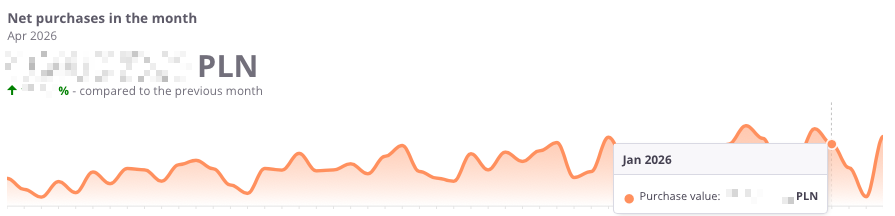
“Net purchases in the month” – the chart presents the net value of purchases for each month, allowing users to track current expenses and analyze how they change month by month.
The chart displays:
-
Net purchase value in a given month – the total cost of purchases made during that period,
-
Timeline axis – enabling monthly comparison of values,
-
Difference from the previous month – indicating whether purchase expenses have increased or decreased.
This chart helps users easily identify months with the highest procurement costs and assess whether purchasing trends are stable, seasonal, or marked by sudden fluctuations.
Net purchases – previous month
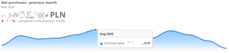
“Net purchases – previous month” – the chart presents the net purchase value compared with the previous month, allowing users to assess how purchasing costs have changed month by month.
The chart displays:
-
Net purchase value in a given month – the total expenditure on purchases,
-
Timeline axis – showing changes in purchase values over consecutive months,
-
Comparison with the previous month – indicating whether costs increased or decreased compared to the earlier period.
Thanks to this chart, users can quickly identify monthly spending trends and see in which periods purchase costs increased or decreased.
Purchases by months
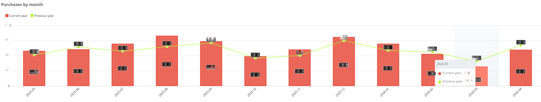
“Purchases by months” – the chart presents the value of purchases broken down by months, distinguishing between the current year and the previous year. This allows users to compare how purchasing costs have evolved over time and whether seasonal variations occur.
The chart displays:
-
Current year (red) – net purchase value for each month of the current year,
-
Previous year (green) – purchase value for the corresponding months of the previous year,
-
X-axis – consecutive months,
-
Y-axis – purchase values.
Thanks to this chart, users can quickly determine whether purchasing costs in the current year are higher or lower than in the previous year, and identify periods of the highest spending.
Purchases - Purchases by warehouses
All values are calculated based on purchase documents (PZ, P-).
All values are converted to PLN according to the exchange rate of the previous day, ensuring a consistent presentation regardless of the document currency.
Purchases by warehouses
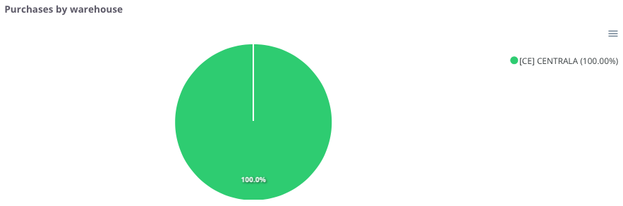
“Purchases by warehouse” – the chart presents the share of purchases broken down by warehouses. It allows users to see which locations account for the largest portion of total purchasing expenses.
The chart displays:
-
individual warehouses – each marked with a different color,
-
percentage share of purchases – indicating what portion of total purchases each warehouse represents.
Thanks to this chart, users can easily identify which warehouse dominates the purchase structure and which ones have less significance.
Purchases by warehouse – table
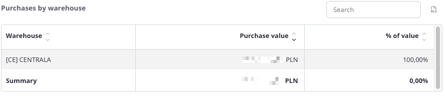
“Purchases by warehouse – table” – the table presents the value of purchases broken down by warehouses. It allows users to identify which warehouse accounts for the largest share of the company’s total expenses.
The table includes the following fields:
-
Warehouse – name of the warehouse,
-
Purchase value – total purchases made in the given location,
-
% Value – percentage share of the warehouse in total purchases.
The table features a search field, allowing users to narrow the data to selected warehouses. In such cases, summaries automatically adjust to the filtered results.
Additionally, data can be sorted by clicking column headers – for example, to arrange warehouses by purchase value or percentage share.
Thanks to this, users can quickly identify which warehouses generate the most purchases and which ones play a smaller role in the company’s cost structure.
Purchases by warehouse over the last 12 months
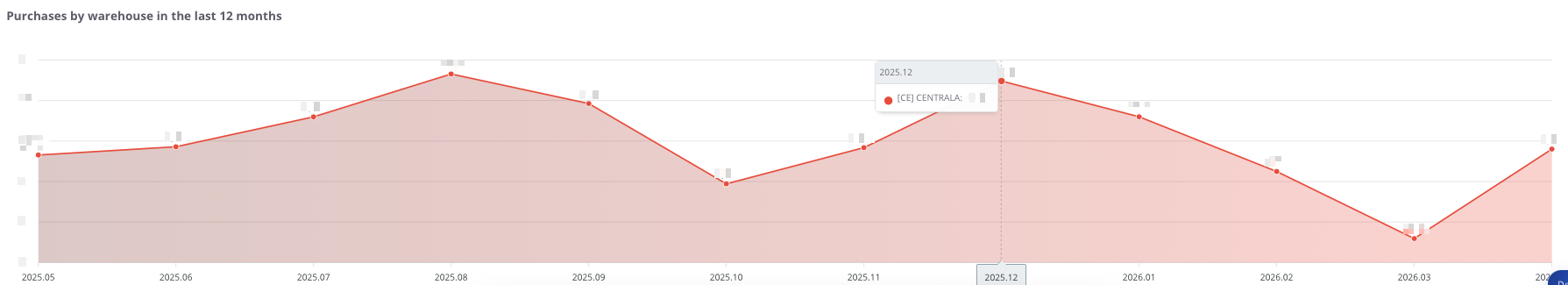
“Purchases by warehouse over the last 12 months” – the chart presents the monthly purchase values, broken down by individual warehouses. It allows users to track how purchases have changed over time and which warehouses generated the highest expenses.
The chart displays:
-
purchase value by warehouse – total purchases assigned to a specific warehouse,
-
timeline axis – consecutive months covering the last 12 months,
-
comparison between warehouses – enabling analysis of how different locations contribute to total costs.
Thanks to this chart, users can easily assess the variability of purchase values across months and determine whether purchases in a given warehouse are stable or subject to significant fluctuations.
Purchases - Purchases by countries
All values are calculated based on purchase documents (PZ, P-).
All values are converted to PLN according to the exchange rate of the previous day, ensuring a consistent presentation regardless of the document currency.
Purchases by country
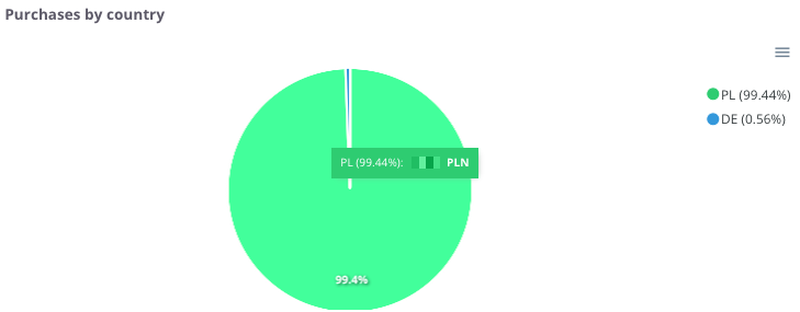
“Purchases by country” – the chart presents the share of purchases broken down by countries from which goods and services originate. It allows users to see in which markets the company incurs the highest purchasing costs.
The chart displays:
-
countries of purchase – each country is marked with a different color,
-
percentage share – showing what portion of total purchase value each country represents.
Thanks to this chart, users can easily identify which country dominates the purchase structure and which markets play a smaller role.
Purchases by country – table
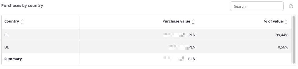
“Purchases by country – table” – the table presents the value of purchases broken down by countries. It allows users to determine which markets have the largest share in the company’s purchasing structure.
The table includes the following fields:
-
Country – name of the country,
-
Purchase value – total expenditure on purchases made in that country,
-
% Value – percentage share of the country in total company purchases.
The table includes a search field, allowing users to narrow the data to selected countries. In such cases, summaries automatically adjust to the filtered results.
Additionally, data can be sorted by clicking column headers – for example, to arrange countries by purchase value or percentage share.
Thanks to this table, users can easily assess which markets dominate the purchase structure and which ones have marginal significance.
Purchases - Purchases by contractors
All values are calculated based on purchase documents (PZ, P-).
All values are converted to PLN according to the exchange rate of the previous day, ensuring a consistent presentation regardless of the document currency.
Purchases by contractors - Top 20
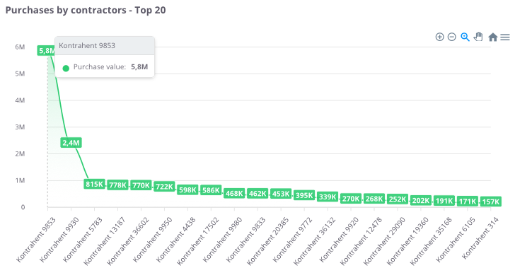
“Purchases by contractors – Top 20” – the chart presents the 20 contractors with the highest purchase value. It allows users to identify which suppliers play a key role in the company’s purchasing structure.
The chart displays:
-
Purchase value (green) – total expenditure with each contractor,
-
X-axis – individual contractors,
-
Y-axis – purchase values.
Thanks to this chart, users can easily assess which contractors generate the highest purchasing costs and compare how spending is distributed among the company’s main suppliers.
Purchases by contractors – Top 100
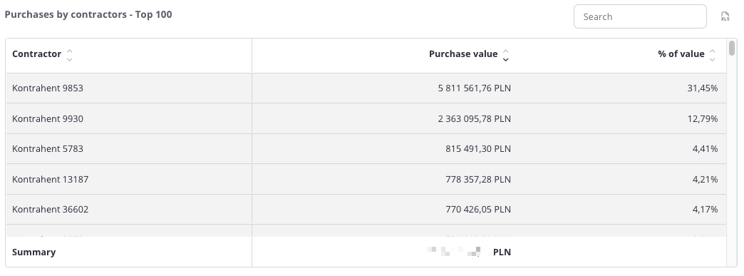
“Purchases by contractors – Top 100” – the table presents a summary of contractors with the highest purchase values. It allows users to identify which suppliers account for the largest share of company expenses and how the purchase structure is distributed.
The table includes the following fields:
-
Contractor – name of the contractor,
-
Purchase value – total expenditure with the given contractor,
-
% of Value – the contractor’s percentage share in total purchase value.
The table includes a search field, allowing users to narrow the data to selected contractors. In such cases, summaries automatically adjust to the filtered results.
Additionally, data can be sorted by clicking column headers – for example, to arrange contractors by purchase value or percentage share.
Thanks to this table, users can easily identify the company’s key suppliers and understand their share in overall purchasing costs.
Operators
User Management
The "Users" tab in the cairo.BI system allows for full management of users with access to the system – from adding new accounts to assigning roles, access levels, and permissions. It serves as a central administrative hub, allowing you to control who can access specific reporting data and to what extent.
Users List
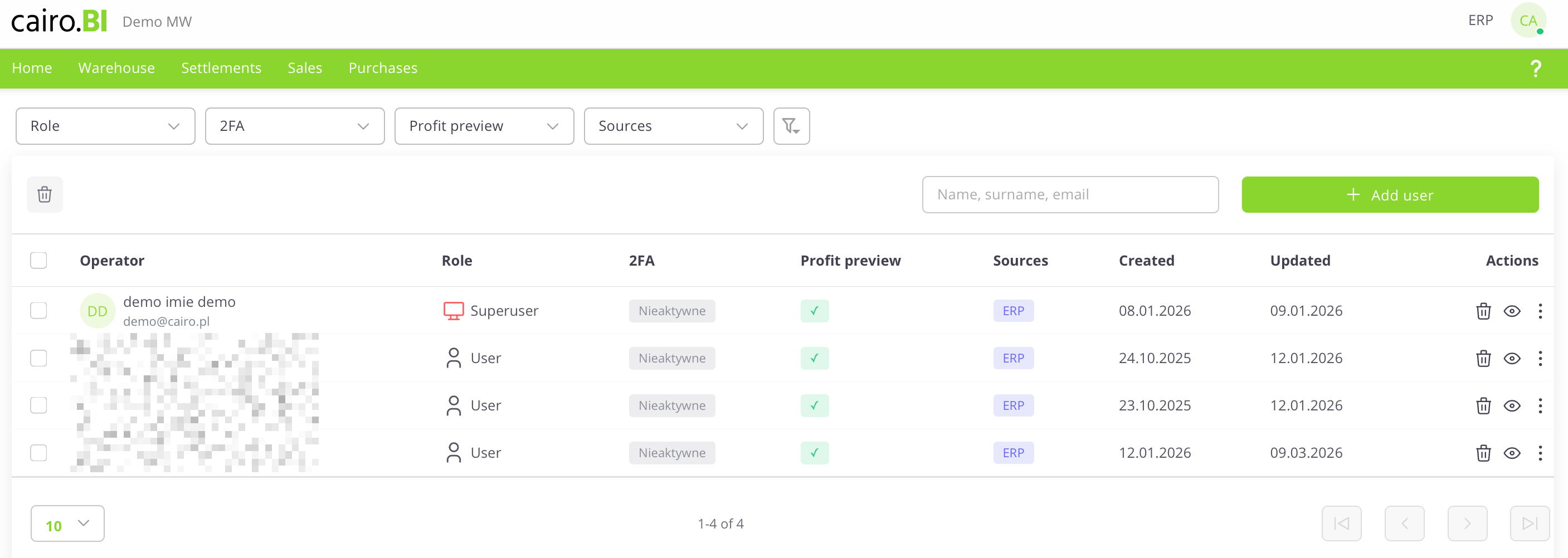
The "User Management" view presents a list of system users along with their permissions and security status. The following information is provided for each user:
-
User – The name, surname, and email address assigned to the account.
-
Role – The level of permissions in the system (e.g., Superuser, User).
-
2FA – The status of two-factor authentication (Active or Inactive).
-
Profit Preview – An indicator (checkmark) showing if the user is authorized to view margins and financial data.
-
Sources – The systems from which the data originates (e.g., ERP).
-
Created – The date the account was registered in the system.
-
Updated – The date of the last modification to the user's data.
-
Actions – A set of tools for managing a specific record: delete (trash icon), preview (eye icon), and edit.
User Card
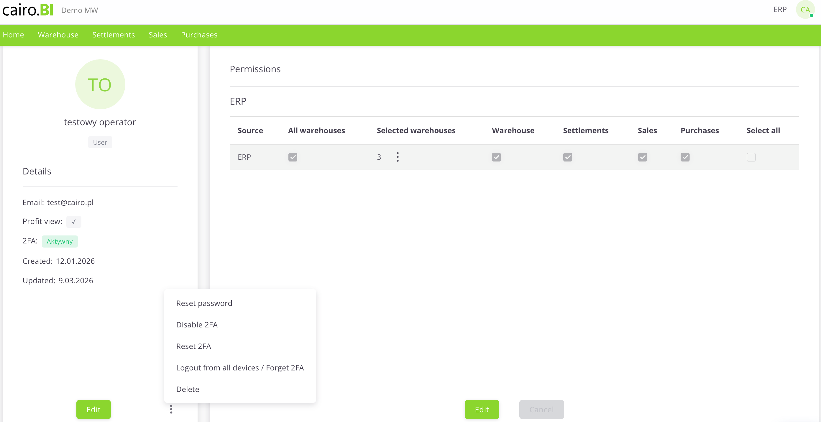
User Card (Details & Permissions)
The "User Card" is a detailed view that allows for full profile editing, account security management, and precise definition of data visibility. The card is divided into an information section and a permissions panel:
Profile Details
Located on the left side of the screen, this section displays basic user information:
-
Initials and Name – A graphical visualization along with the user's full name and assigned role.
-
Email – The address used for logging in and system communication.
-
Profit Preview – A toggle/indicator for margin visibility.
-
2FA – Current two-factor authentication status.
-
Created / Updated – Registration and last activity dates.
Permission Management
The main table allows you to assign access to specific modules and warehouses:
-
Source – The data source system (e.g., ERP).
-
All Warehouses – A collective checkbox granting access to the entire warehouse structure.
-
Selected Warehouses – A function allowing for the selective choice of specific warehouses (e.g., 03, CE, 02) via a dropdown list.
-
Tab Access (Warehouse, Settlements, Sales, Purchases) – Specific checkboxes that determine if a user has access to the corresponding sections (tabs) in the main system menu.
-
Select All – A button to quickly select all available permissions for a given source.
Additional Actions Menu
Available under the "three dots" icon, these buttons allow for advanced account administration:
-
Reset Password – Forces the user to change their password.
-
Disable / Reset 2FA – Manages the additional layer of account security.
-
Logout from all devices / Forget 2FA – Immediately terminates all active sessions and trusted device settings for the user.
-
Delete – Completely removes the user card from the system.
Adding a new user
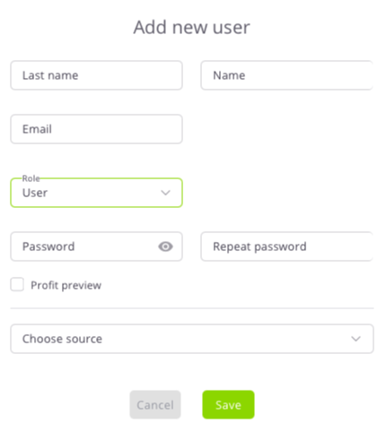
The "Add New User" configuration window allows you to enter identification data and define the user's initial role and access levels. The following fields are completed in the form:
-
Surname and Name – Text fields for user identification.
-
Email – The address used as the login for the platform.
-
Role – A dropdown list to choose the access level: Superuser or User.
-
Password / Repeat Password – Fields to define the access key with an option to preview characters.
-
Profit Preview – A checkbox determining the right to view financial data.
-
Select Source – A dropdown list to indicate the data source system (e.g., ERP).
Data is confirmed with the "Save" button, or discarded using "Cancel".
Superuser
A user with Superuser permissions has full access to all data and system functions. This role can:
-
Add, delete, and edit users.
-
Assign roles, sources, and warehouses.
-
Grant or revoke permissions.
-
Manage system configuration.
It is recommended to grant Superuser status only to trusted system administrators.
Two-Factor Authentication (2FA)
Two-factor authentication (2FA) provides an extra layer of security, requiring not just a password but also a unique code generated in a mobile app during login.
1. Monitoring 2FA Status
Security status can be checked in two views:
-
User Table: The "2FA" column shows if the function is Active (white/gray) or Inactive (light gray).
-
User Card: The "Details" section (left panel) displays the current status (e.g., 2FA: Active).
2. Activation and Configuration
Activation is performed through the profile edit mode:
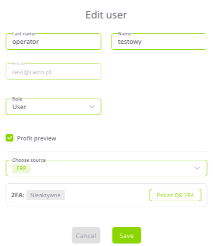
-
The 2FA section is located in the "Edit User" window.
-
If the status is Inactive, click the "Show 2FA QR" button to display a code to be scanned in an authenticator app (e.g., Google Authenticator).

Operators-old
The “Operators” tab in the cairo.BI system allows full management of users who have access to the platform – from adding new accounts to assigning roles, data sources, and permissions.
It serves as a central administration panel for controlling who can access which reports and data.
Operator List
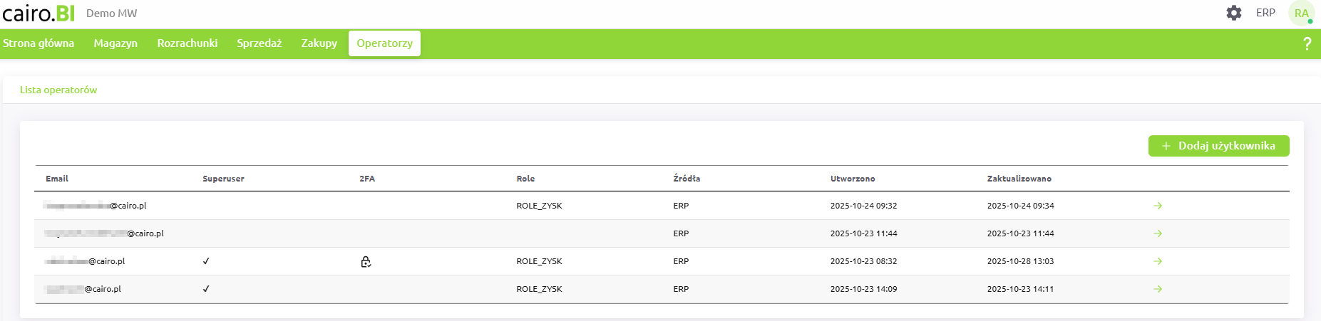
The main screen displays a list of all registered users in the system.
Each record contains key information:
-
Superuser – indicates a user with full administrative permissions,
-
2FA – information on whether two-factor authentication (Two-Factor Authentication) is enabled,
-
Role (Roles) – set of permissions assigned to the user,
-
Source (Sources) – system from which the user’s data is drawn (e.g., ERP, B2B),
-
Created / Updated – timestamps of account creation and last modification.
Each operator has an ➜ icon, which opens the user’s detailed profile.
Operator Profile

The operator profile view displays detailed information about the selected user, including:
-
the user’s email address,
-
Superuser status,
-
assigned roles,
-
two-factor authentication (2FA) status,
-
list of available data sources and roles assigned to each,
-
information about warehouse access (e.g., “Access to all warehouses”).
From the profile screen, the following actions are available:
-
Edit user – modify user details, roles, sources, or permissions,
-
Change password – reset the user’s password,
-
Reset 2FA – remove the existing two-factor authentication configuration,
-
Delete – permanently remove the user account from the system.
If two-factor authentication is enabled, a “Show QR code” option appears, allowing the user to re-pair their authentication app.
Adding a New Operator
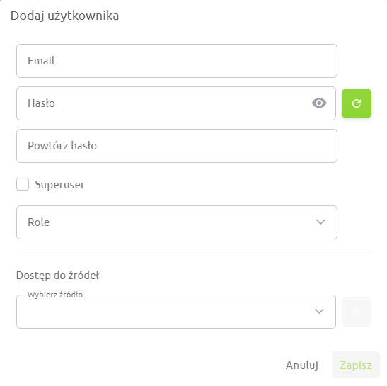
To add a new user, click the “+ Add user” button in the operator list.
In the form, you can specify:
-
user’s email address,
-
password and confirmation,
-
Superuser status,
-
assigned roles,
-
data sources (e.g., ERP, B2B),
-
warehouses the user has access to (all or selected ones).
Roles and Permissions
Roles define which sections of the system a user can access:
-
ROLE_MAGAZYN – access to warehouse reports and analytics,
-
ROLE_ROZRACHUNKI – access to receivables, liabilities, and balance reports,
-
ROLE_SPRZEDAZ – access to sales analytics and reports,
-
ROLE_ZAKUPY – access to purchasing reports,
-
ROLE_ZYSK – access to profit and margin data.
If an operator does not have the ROLE_ZYSK permission, all columns and charts related to profit and % profit will be hidden or displayed as 0.
When this role is enabled, the user gains full visibility into profitability and margin data.
Data Sources
Each operator can have access to different data sources – e.g., ERP systems, B2B modules, and, in the future, other integrated environments.
Administrators can assign one or multiple sources to a user, precisely controlling which data is available to them.
Warehouse Access
When assigning roles and sources, it is also possible to define access to specific warehouses.
Administrators can:
-
grant access to all warehouses, or
-
select specific locations (e.g., [CE] Central, [03] Warehouse 03, [02] Warehouse 02).
This ensures each user sees only the data relevant to their scope of work.
Superuser
A Superuser has full access to all system data and functionalities.
They can:
-
add, delete, and edit operators,
-
assign roles, sources, and warehouse access,
-
manage permissions,
-
configure system settings.
It is recommended to grant Superuser status only to trusted system administrators.
Two-Factor Authentication (2FA)
Two-factor authentication (2FA) enhances login security.
Once enabled, the user must provide a one-time code from an authentication app in addition to their password.
-
2FA can be activated or reset only during operator editing.
-
When active, the operator profile displays the status “Enabled” and a “Show QR code” button.
-
After resetting or deactivation, the status changes to “Disabled”.
The “Operators” tab in cairo.BI provides full control over user accounts, roles, access levels, and authentication security — ensuring efficient and safe management of your analytics environment.