Home tab
The Home tab in the cairo.BI system provides a summary of key financial and operational information, enabling a quick overview of the company’s situation. It is a kind of start dashboard that combines the most important indicators from sales, settlements, and warehouse management.
The screen includes the following elements:
-
Net sales in the month – presents the current sales result along with the change compared to the previous month.
-
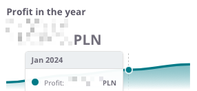
Sales profit in the month – shows how much the company actually earned in the given month.
-
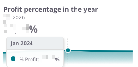
Profit percentage in the month – a profitability indicator calculated as a percentage, making it easier to assess sales margins.
-
Net sales in the year – the value of sales in annual terms.
-
Sales profit in the year – the cumulative financial result.
-
Profit percentage in the year – profitability on an annual scale.
Additionally, the user has access to detailed charts:
-
Unsettled value in PLN – a pie chart showing the proportions between receivables and liabilities, along with their aging (e.g., current, 1–10 days, 11–30 days, 31–60 days, 60> days).
-
Sales by months – a column-line chart comparing sales and profit broken down by months, set against the previous year.
-
Warehouse value – a visualization showing the share of individual warehouses in the total stock value.
The Home tab is the center of quick insights, allowing for instant analysis of sales results, profits, liabilities, and inventory status. Thanks to this, managers can react quickly to changes and make accurate business decisions.
All values are calculated based on sales documents (WZ, PG, GP, ZW).
All values are converted to PLN according to the exchange rate of the previous day, which ensures consistent presentation regardless of the document currency.
Net sales in the month
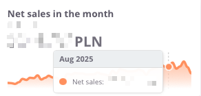
The Net sales in the month indicator presents the value of sales achieved in a given month, including a comparison to the result from the previous period. This makes it easy to quickly assess whether the sales dynamics are increasing or decreasing.
The chart displays:
-
net sales value in the selected month,
-
monthly trend – a line showing changes in sales over time
Thanks to this indicator, the user can easily monitor the current condition of sales and track short-term changes in the company’s performance.
Sales profit in the month
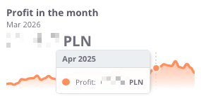
The profit in the month indicator presents the monthly financial result, meaning the difference between sales revenues and the costs of generating them. This makes it possible to continuously monitor how the company generates margin in the short term.
The chart displays:
-
profit achieved in the given month,
-
monthly trend – a line illustrating changes over time
Thanks to this indicator, the user can quickly verify whether sales are profitable in the short term, and detect possible declines or increases in profitability in individual months.
Profit in the month (%)
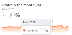
The Profit in the month (%) indicator shows what portion of the revenues achieved in a given month represents profit after deducting costs. It is a key measure of profitability that makes it possible to assess whether the company maintains an appropriate level of operating margin.
The chart presents:
Thanks to this indicator, the user can quickly verify whether the margin remains at a safe level, as well as identify moments when the company operated with higher or lower financial efficiency.
Net sales in the year
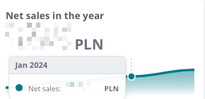
The Net sales in the year indicator presents the total value of sales achieved in a given calendar year. It makes it possible to analyze how the company develops on an annual basis and to compare results between individual years.
The chart presents:
-
net sales value in the given year,
-
time axis – enabling observation of year-to-year changes,
-
sales trend – allowing quick assessment of whether the company is increasing its scale of operations or experiencing sales declines.
Thanks to this indicator, the user gains a complete picture of how the company has been performing over the years, which forms the basis for assessing long-term stability and business growth.
Profit in the year
The profit in the year indicator illustrates the company’s annual financial result – that is, the difference between sales revenues and the costs of generating them. This makes it possible to track how the company’s profitability develops on a yearly basis.
The chart presents:
-
the profit value in the given year,
-
time axis, allowing comparison of results year to year,
-
profitability trend, indicating whether the company maintains stable margins, increases profitability, or faces declines.
Thanks to this overview, the user can quickly assess whether the company’s annual financial results confirm its operational efficiency and economic stability.
Profit percentage in the year
The Profit percentage in the year indicator shows the relationship between profit and sales value on an annual basis, i.e., the profit margin the company achieves on sales. It is a key measure that makes it possible to assess how effectively the company generates profit in relation to its revenues.
The chart presents:
-
the percentage level of profit in the given year,
-
time axis, which allows observation of changes in profitability across individual years,
-
profitability trend, indicating whether the company maintains a stable margin, improves efficiency, or experiences declines.
Thanks to this indicator, the user can easily assess whether the company maintains a satisfactory level of profitability in the long term and compare the dynamics of changes with previous years.
Unsettled value in PLN
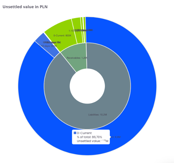
The chart presents the structure of unsettled receivables and liabilities broken down into time intervals. It shows what portion of amounts remains open on the side of receivables (marked in red) and liabilities (marked in blue).
The chart presents:
-
receivables – amounts the company should receive from contractors,
-
liabilities – amounts the company must settle with suppliers,
-
time intervals (0–current, 1–10 days, 11–30 days, 31–60 days, 60> days) – allowing identification of how long values have remained unsettled.
Thanks to this, the user can quickly identify whether the company has a greater issue with recovering receivables or settling liabilities, as well as assess in which time intervals the arrears are accumulating.
Sales by months
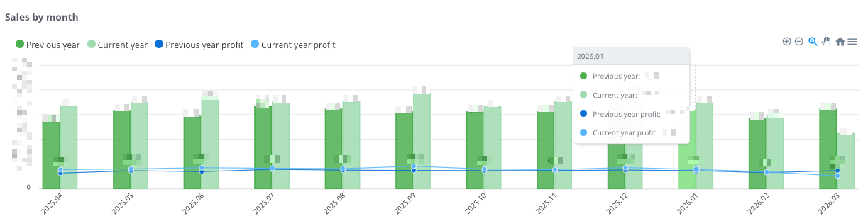
The chart presents a comparison of sales and profits on a monthly basis, showing data from the current year and the previous year. This makes it possible to track seasonal trends and assess how the current results compare with the same months of the previous year.
The chart shows:
-
Dark green columns – sales value for the previous year.
-
Light green columns – sales value for the current year.
-
Dark blue line and points – profit value for the previous year.
-
Light blue line and points – profit value for the current year.
-
Time axis (months) – displays the dynamics of financial changes over the analyzed periods.
With this comparison, the user can:
-
quickly assess whether sales and profit in the current year are higher or lower compared to the previous year,
-
identify periods of growth and decline,
-
analyze the cyclicality of sales and profitability in a monthly breakdown.
Warehouse Value
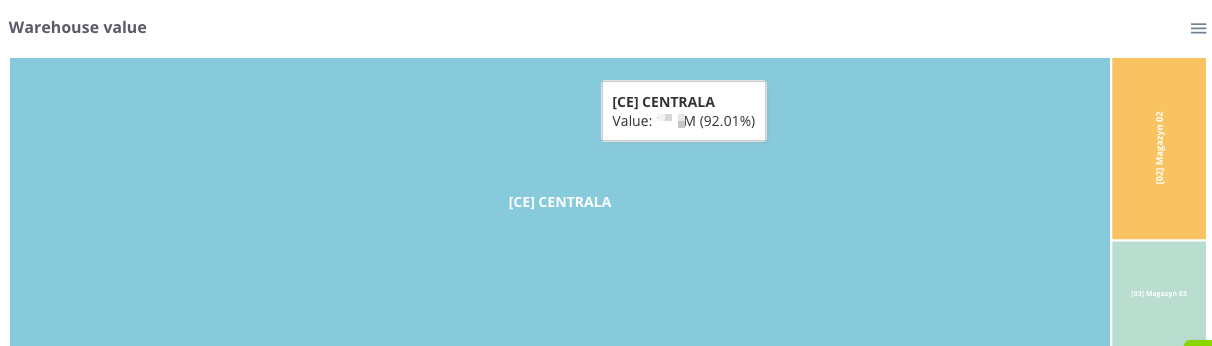
The Warehouse Value chart presents the structure and share of individual locations in the total value of the company's inventory. Thanks to the proportional division of space, the user can instantly assess which warehouses store the largest portion of the capital invested in stock.
The chart presents the following:
Tile size – corresponds to the total value of goods in a given warehouse. The larger the area a given rectangle occupies, the higher the value of the stock located there relative to the total.
Diverse colors – allow for quick visual differentiation between individual warehouses or company branches.
Information labels – contain the warehouse name, its monetary value, and its percentage share in the total stock level of the company.
Thanks to this indicator, the user can instantly verify the allocation of goods within the company structure, which facilitates logistics management and delivery planning, and allows for effective optimization of stock levels in key locations.