
Monthly analysis
All values are calculated based on purchase documents (PZ, P-).
All values are converted to PLN according to the exchange rate of the previous day, ensuring a consistent presentation regardless of the document currency.
Net purchases per month
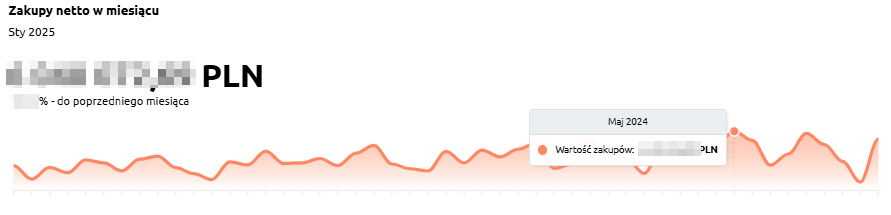
“Net purchases per month” – the chart presents the net value of purchases for each month, allowing users to track current expenses and analyze how they change month by month.
The chart displays:
-
Net purchase value in a given month – the total cost of purchases made during that period,
-
Timeline axis – enabling monthly comparison of values,
-
Difference from the previous month – indicating whether purchase expenses have increased or decreased.
This chart helps users easily identify months with the highest procurement costs and assess whether purchasing trends are stable, seasonal, or marked by sudden fluctuations.
Net purchases – previous month
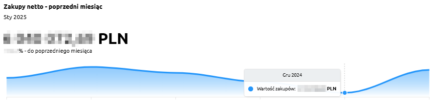
“Net purchases – previous month” – the chart presents the net purchase value compared with the previous month, allowing users to assess how purchasing costs have changed month by month.
The chart displays:
-
Net purchase value in a given month – the total expenditure on purchases,
-
Timeline axis – showing changes in purchase values over consecutive months,
-
Comparison with the previous month – indicating whether costs increased or decreased compared to the earlier period.
Thanks to this chart, users can quickly identify monthly spending trends and see in which periods purchase costs increased or decreased.
Purchases by months
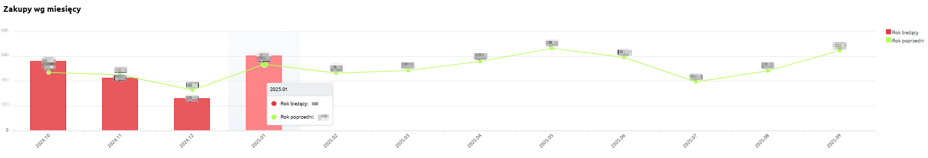
“Purchases by months” – the chart presents the value of purchases broken down by months, distinguishing between the current year and the previous year. This allows users to compare how purchasing costs have evolved over time and whether seasonal variations occur.
The chart displays:
-
Current year (red) – net purchase value for each month of the current year,
-
Previous year (green) – purchase value for the corresponding months of the previous year,
-
X-axis – consecutive months,
-
Y-axis – purchase values.
Thanks to this chart, users can quickly determine whether purchasing costs in the current year are higher or lower than in the previous year, and identify periods of the highest spending.