
Annual summary
All values are calculated based on sales documents (WZ, PG, GP, ZW).
All values are converted to PLN according to the exchange rate of the previous day, ensuring consistent presentation regardless of the document currency.
Annual sales value
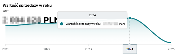
“Annual sales value” – the chart presents the annual sales value in both historical and current perspectives. It allows users to assess how sales have evolved over the years and compare the dynamics of changes between periods.
The chart displays:
-
Sales value in a given year – the total sum of all sales documents recorded for the selected year,
-
Timeline axis – enabling comparison of values across consecutive years.
Thanks to this chart, users can quickly identify annual sales trends and pinpoint the years in which sales increased or decreased.
Profit from sales in the year
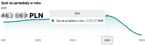
“Profit from sales in the year” – the chart presents the annual profit generated from sales. It allows users to assess how the company’s financial results have evolved over the years and whether it achieved higher or lower margins in different periods.
The chart displays:
-
Profit from sales in a given year – total sales revenue minus costs,
-
Timeline axis – enabling year-to-year comparison of results.
Thanks to this chart, users can easily analyze profitability trends in sales and determine whether the company is moving toward greater financial efficiency.
Profit percentage in the year
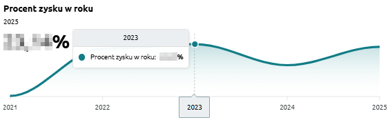
“Profit percentage in the year” – the chart presents the sales profit margin in annual terms. It allows users to assess how sales profitability has evolved over the years.
The chart displays:
-
Profit percentage in a given year – the share of profit in total sales value,
-
Timeline axis – enabling comparison of results across consecutive years.
Thanks to this chart, users can easily track profitability trends and determine whether the company maintains a stable profit margin or experiences fluctuations over time.
Sales and profit over the years
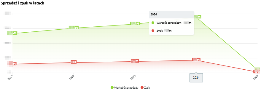
“Sales and profit over the years” – the chart presents the sales value and profit in annual terms. It allows users to assess how the scale of sales has changed and whether the increase in sales corresponds with growth in profitability.
The chart displays:
-
Sales value (green) – total sales in a given year,
-
Profit (red) – financial result from sales in a given year,
-
Timeline axis – comparison of results across consecutive years.
Thanks to this chart, users can easily analyze the relationship between sales and profit and determine whether the company is developing in a balanced and profitable manner.
Sales and profit over the years - table
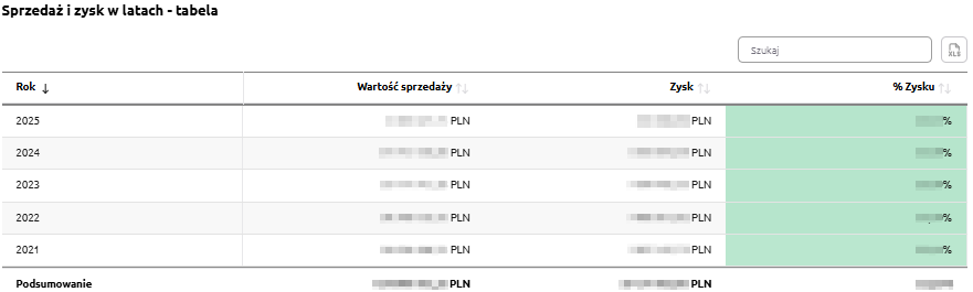
“Sales and profit over the years – table” – this summary presents annual sales data, allowing comparison of results over multiple years.
The table includes the following fields:
-
Year – the analyzed period,
-
Sales value – total sales in a given year,
-
Profit – financial result from sales,
-
% Profit – percentage share of profit in total sales value.
The table uses color highlighting:
-
Green – the more intense the color, the higher the share of profit in total sales,
-
Red – indicates a negative financial result, i.e., a loss.
Thanks to this, the user can quickly compare sales values, profits, and profitability percentages across years and assess whether the company maintains a stable level of profitability.
The table includes a search field that allows narrowing the data to selected years. In such cases, summaries automatically adjust to the filtered results.
Additionally, data can be sorted by clicking column headers – for example, to arrange years by sales value or profitability level.