
Purchases by warehouses
All values are calculated based on purchase documents (PZ, P-).
All values are converted to PLN according to the exchange rate of the previous day, ensuring a consistent presentation regardless of the document currency.
Purchases by warehouses
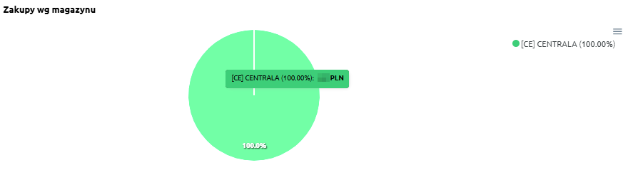
“Purchases by warehouse” – the chart presents the share of purchases broken down by warehouses. It allows users to see which locations account for the largest portion of total purchasing expenses.
The chart displays:
-
individual warehouses – each marked with a different color,
-
percentage share of purchases – indicating what portion of total purchases each warehouse represents.
Thanks to this chart, users can easily identify which warehouse dominates the purchase structure and which ones have less significance.
Purchases by warehouse – table
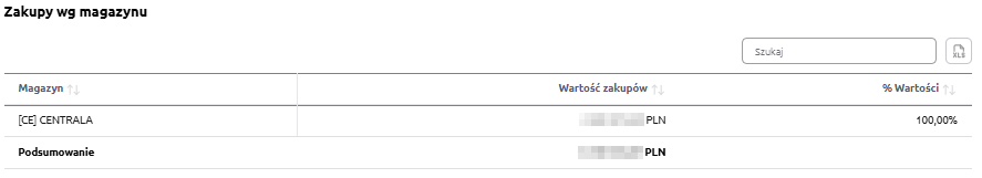
“Purchases by warehouse – table” – the table presents the value of purchases broken down by warehouses. It allows users to identify which warehouse accounts for the largest share of the company’s total expenses.
The table includes the following fields:
-
Warehouse – name of the warehouse,
-
Purchase value – total purchases made in the given location,
-
% Value – percentage share of the warehouse in total purchases.
The table features a search field, allowing users to narrow the data to selected warehouses. In such cases, summaries automatically adjust to the filtered results.
Additionally, data can be sorted by clicking column headers – for example, to arrange warehouses by purchase value or percentage share.
Thanks to this, users can quickly identify which warehouses generate the most purchases and which ones play a smaller role in the company’s cost structure.
Purchases by warehouse over the last 12 months
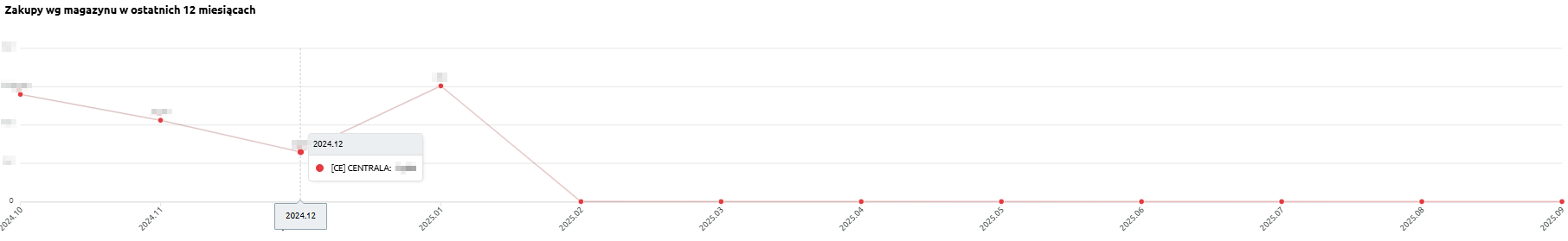
“Purchases by warehouse over the last 12 months” – the chart presents the monthly purchase values, broken down by individual warehouses. It allows users to track how purchases have changed over time and which warehouses generated the highest expenses.
The chart displays:
-
purchase value by warehouse – total purchases assigned to a specific warehouse,
-
timeline axis – consecutive months covering the last 12 months,
-
comparison between warehouses – enabling analysis of how different locations contribute to total costs.
Thanks to this chart, users can easily assess the variability of purchase values across months and determine whether purchases in a given warehouse are stable or subject to significant fluctuations.